Style Guide

Learn how to use the Sogolytics logo, product icons, and other brand elements in your projects and creatives.

Logos and Emblems

The main logo is the wordmark written in a custom Serenity font with the two color chat bubble emblem inside a black box. Similarly the main emblem is the two color chat bubble inside a black square. This version should be used in the majority of cases.
Sogolytics Logo
Sogolytics Logo Black BG
Sogolytics Logo Favicon Black BG
Sogolytics Logo Black Invert
Sogolytics Logo Favicon White Black Invert
Sogolytics Logo Green BG
Sogolytics Logo Favicon

Brand Colors

Sogolytics' colors help bring the brand to life and make things feel consistent.
This section shows how to use them in a way that feels clear, balanced, and easy to recognize.

Primary Colors
The core expression of our brand identity. Used consistently across key brand elements to build strong recognition and visual ownership.

Lonavala
#006159

Nuesonzo
#00A7B5

Secondary Color Palette
Extends the primary palette with greater flexibility and depth. Uses to support layouts, illustrations, data visualization, and visual hierarchy.

#093033

#004E3C

#13B39A

#28B55F

#99E2FF

#D7FB77

Accent and Supportive Colors
Adds emphasis and visual interest where needed. Accent colors highlight key moments, while supportive colors provide balance, contrast, and structure.

#80F4E3

Accent

#FFD84D

Accent

#00DF82

Accent

#DADEE6

Supportive

#FFFFFF

Supportive

#18181B

Supportive
Functional/Feedback Colors
Functional colors communicate status, guide user actions, and provide visual feedback. These include success, warning, error, and info states. Use them consistently in UI elements like buttons, alerts, and messages to improve usability and ensure a clear user experience.

#5C6069

#9CA3B5

#E7E9E9

#DADEE6

#DBD0D0

#FFFFFF

These colors with their shades, tints, tones is for Pie charts, statistic graphs, infographic along with above color pallets.

#15267F

#3F2484

#0B759D

#027C8B

#73223F

#B65535

Especially in UI applications—such as dashboards, infographics, notices, and web interfaces—use these colors sparingly as subtle accents to highlight key information while maintaining a clean and balanced visual experience.

#30DB6A

Success

#44BDFF

Information

#FFE8A8

Warning

#FFC6C6

Error

#DADEE6

Neutral

Pattern Style

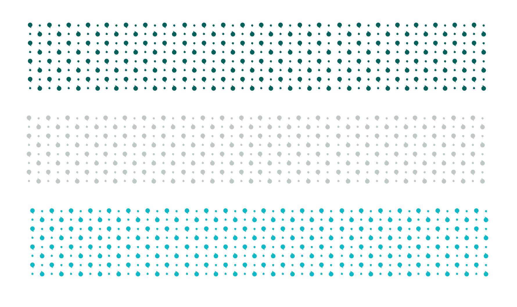
Patterns add a distinctive and flexible visual layer to the brand, creating texture without overwhelming the content. Built from consistent geometric elements, they can be adapted across brand colors, layouts, and applications while maintaining a cohesive identity.

Typography

Primary Font
The main typeface to be used universally is Faculty Glyphic. This is the Main and Primary font, but have to use very specifically.
Uses: For Headings, Main title use this font prominently in website. Other marketing and promotional assets this can be use.
Omni
Report
ABCDEF
GHIJKL
MNOPQ
RSTUV
WXYZ
CREATE
YOUR
SURVEY
!@#$%
&*();/<>
“”{}+?
Lorem ipsum dolor sit amet, consectetur adipiscing elit, sed do eiusmod tempor incididunt ut labore et dolore magna.
1
2
3
4
5
6
7
8
9
Faculty Glyphic
Epilogue

Sogolytics is the official name of the company and platform—use “Sogolytics” in text and “sogolytics” only in the logo. Informally, “Sogo” is fine (not stylized), especially in hashtags, but avoid awkward pluralization or inconsistent capitalization.

Typing the Sogolytics name correctly

Images

We use natural, authentic images that highlight real people, collaboration, and technology—capturing moments that feel human, focused, and genuinely relevant to our brand and users.

People
Professional woman smiling while using her phone
Colleagues celebrating together in the office
Team
Two colleagues reviewing a tablet together
Speaker recording a podcast at a desk microphone
Technology
Customer being helped at a reception desk with a tablet
Students working together at a classroom table
People
Professional woman smiling while using her phone
Team
Two colleagues reviewing a tablet together
Technology
Customer being helped at a reception desk with a tablet

Imagery Composition

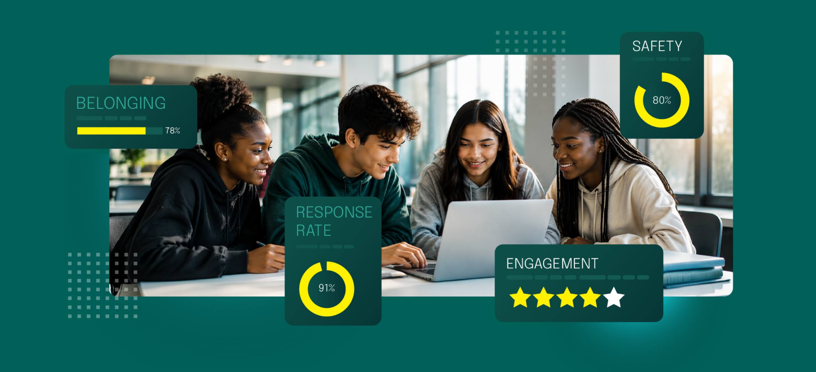
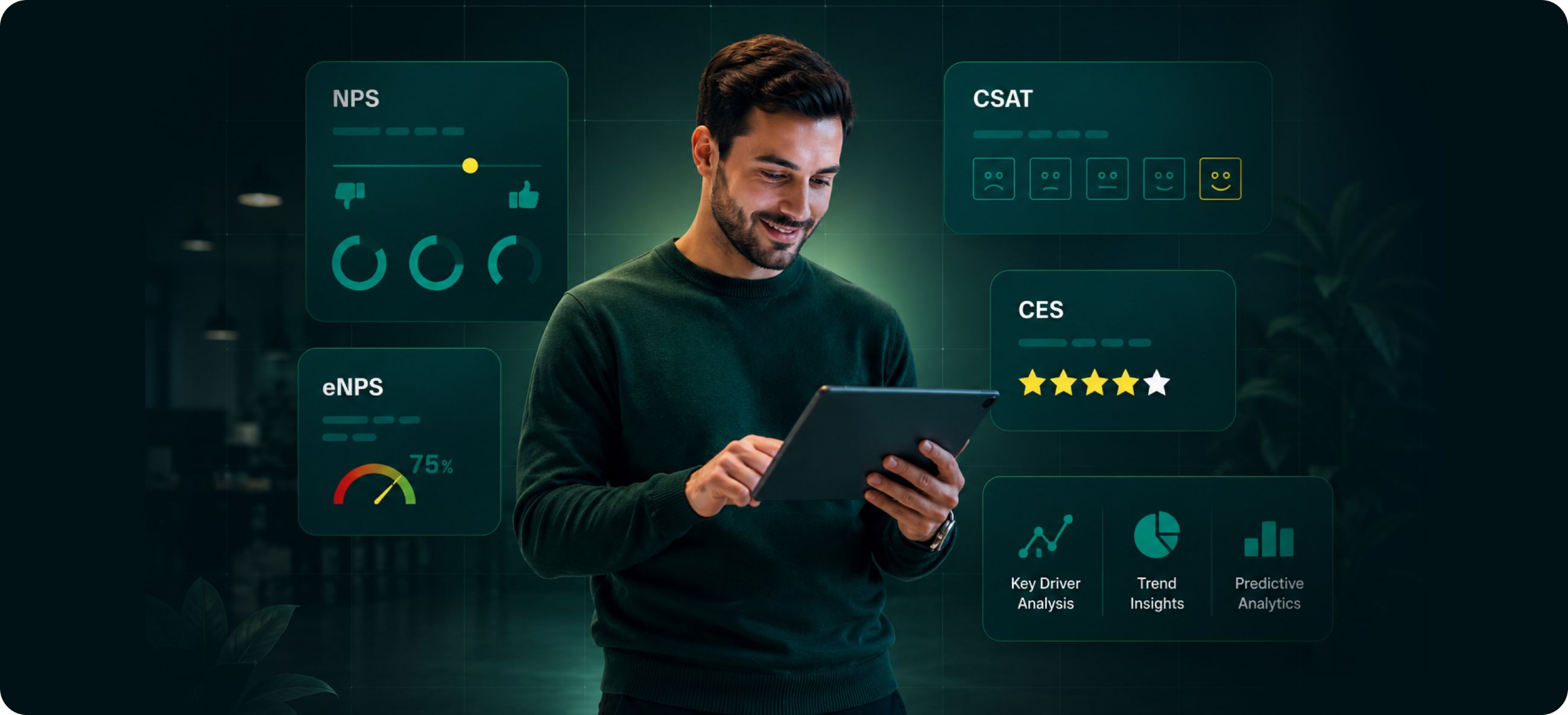
Our imagery compositions put people at the center—blending authentic human moments with subtle digital elements to communicate intelligence, clarity, and purposeful action. In short a simple storytelling.

Woman using a tablet surrounded by report, insight, automation and AI text analysis callouts
Students on laptops with belonging, response rate, safety and engagement score callouts
Man using a tablet surrounded by NPS, CSAT, CES and eNPS insight panels
Laptop dashboard showing NPS, CSAT and CES scores beside trend and map charts

Explore this easy to use collection of design assets and begin creating your content now.

Client

Company Size

Industries

Customer Since

Read more

Typical Rave Review

Description