



CX Dashboard: Text Analysis
Unlock deeper insights from your employee feedback with the enhanced capabilities of Text Analysis, powered by OpenAI. While metric questions are essential for understanding employee experien
Unlock deeper insights from your employee feedback with the enhanced capabilities of Text Analysis, powered by OpenAI. While metric questions are essential for understanding employee experiences, exploring the reasons behind the ratings is equally important. Whether feedback is positive or negative, open-ended responses provide valuable insights that help shape decisions and drive meaningful improvements.
Text Analysis enables you to identify common topics and analyze positive, neutral, or negative feedback with ease. Drill down into key segments to understand what drives employee sentiment and take informed action.
Only questions marked as follow-up in CX projects are processed on the Dashboard.
Navigate to
Open-Ended Responses
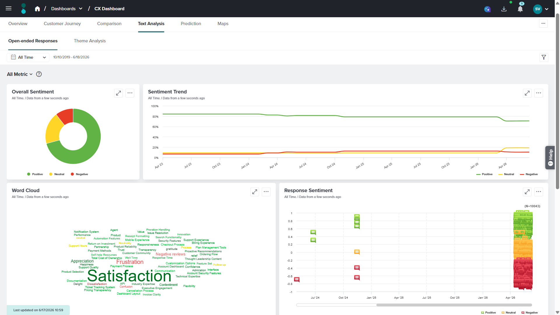
Available Widgets in this tab
Overall Sentiment
The Overall Sentiment widget, displayed in the top-left corner, shows sentiment distribution using a Donut chart categorized into Positive, Neutral, and Negative. Hovering over a sentiment reveals the total number of responses, percentage share, and the percentage change compared to the previous day, month, or year.
The three-dot menu in the top-right corner of the widget has the following options:
- Graph type: This option allows you to change the graph type of this widget. The available graph types are Donut Chart, Pie Chart, Bar Chart, Column Chart, Area Chart, Horizontal Stacked Bar and Vertical Stacked Bar.
- Share: This option allows you to share access to the real time data of this widget with anyone who has this link.
- Download: This option allows you to download this widget as a PDF or an image file(png and jpeg).
- Refresh: This option allows you to refresh the data of this widget.
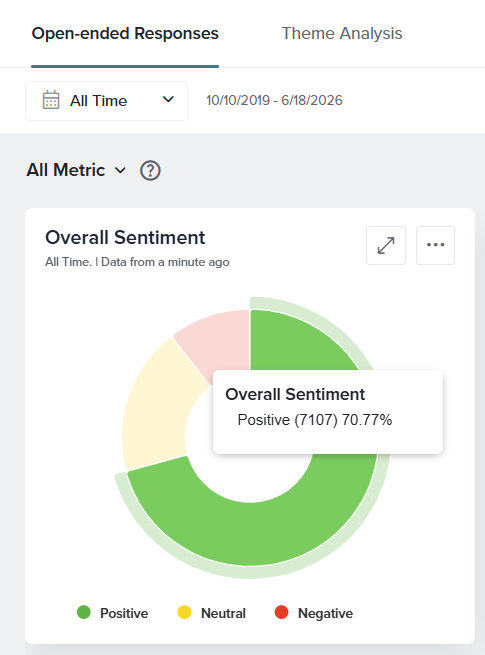
Sentiment Trend
This widget displays sentiment trends using a vertical stacked bar chart across daily, weekly, monthly, quarterly, or yearly intervals. Hovering over any data point shows response counts and percentage distribution for each sentiment, along with percentage change compared to the previous time period.
The three-dot menu in the top-right corner of the widget has the following options:
- Calculation: There are two types of calculation methods available:
- Cumulative: Cumulative refers to a calculation method where data is aggregated over time, meaning each data point includes all previous data up to that point.
- Non-cumulative: Each point on the graph represents values collected within that specific time range only (e.g., that day, week, or month).
For example:
January: 100 responses, 80 positive → 80%
February: 50 responses, 30 positiveTherefore, Cumulative for positive responses till February is,
Total responses = 150
Total positive = 110
Positive % = 73.3%So, February reflects January + February combined, not just February alone.
For example:
January: 20 positive responses
February: 30 positive responses
The chart will show 20 and 30 separately, with no carryover from earlier months. - Graph type: This option allows you to change the graph type of this widget. The available graph types are Donut Chart, Pie Chart, Bar Chart, Column Chart, Area Chart, Horizontal Stacked Bar and Vertical Stacked Bar.
- Frequency: This option allows you to configure the X-axis as Daily, Weekly, Monthly, Quarterly, or Yearly.
- Scale Range: Choose between Original Range or Best Fit.
- Share: This option allows you to share access to the real-time data displayed in the widget. When you click Share, a unique link is generated that can be copied and shared with others. Anyone with access to this link can view the word cloud and see updates in real time.
- Download: This option allows you to download this widget as a PDF or an image file(png and jpeg).
- Refresh Data: This option allows you to refresh the data of this widget.
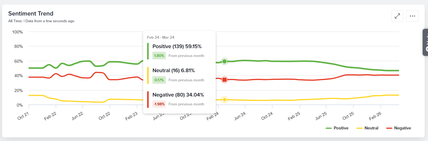
Word Cloud
The Word Cloud visually represents the most frequently used terms in free-text responses. Words that appear more often are displayed in a larger size, making it easy to identify key topics and trends at a glance. You can click any word in the cloud to drill down into the associated responses and further explore related sentiment, themes, and emotions. It also displays Response Sentiment and Responses associated to that word. The three-dot menu in the top-right corner of the widget provides access to the following options:
- Word type: This option allows you to display either of the two Themes or Emotions.
- Word Count: This option allows you decide how many words should be displayed in the Word Cloud. You can select any number between 1 to 70.
- Refresh Data: This option allows you to refresh the data of this widget.
- Share: This option allows you to share access to the real-time data displayed in the widget. When you click Share, a unique link is generated that can be copied and shared with others. Anyone with access to this link can view the word cloud and see updates in real time.
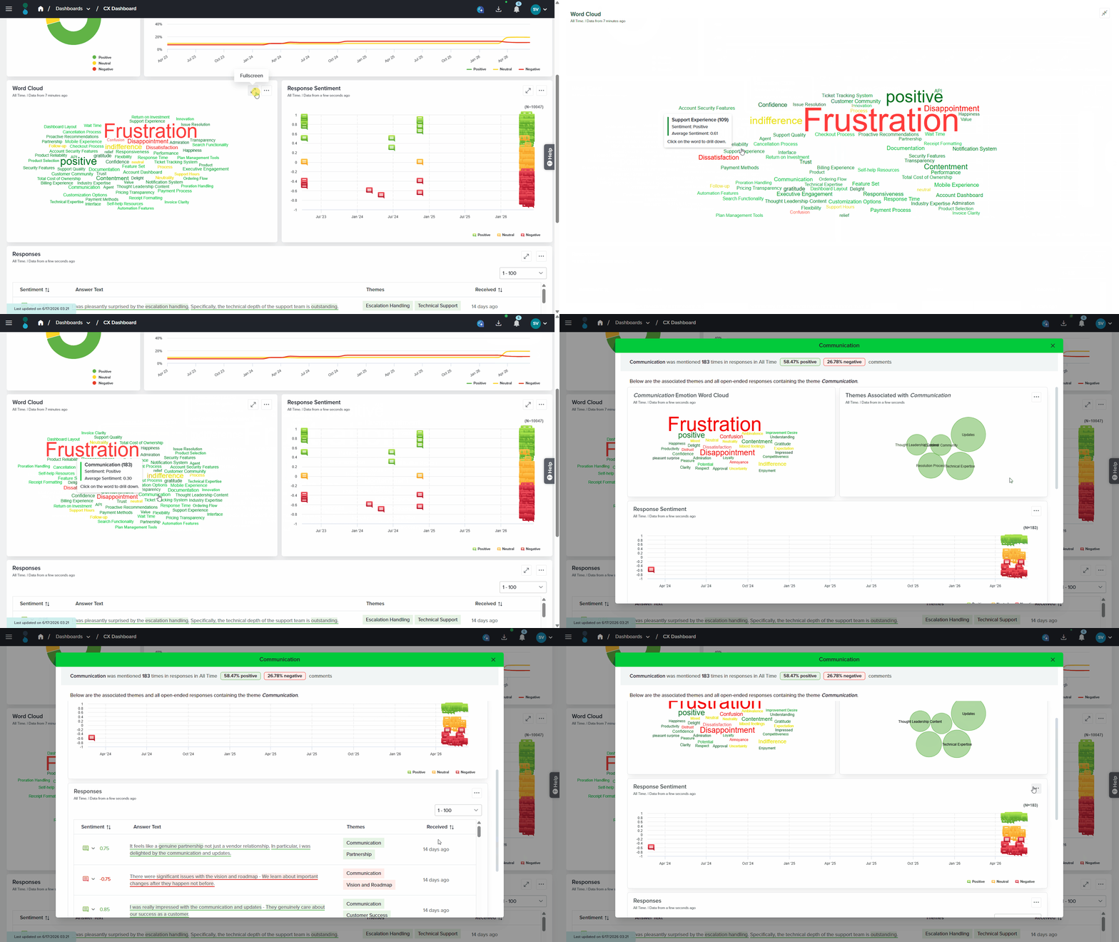
Response Sentiment
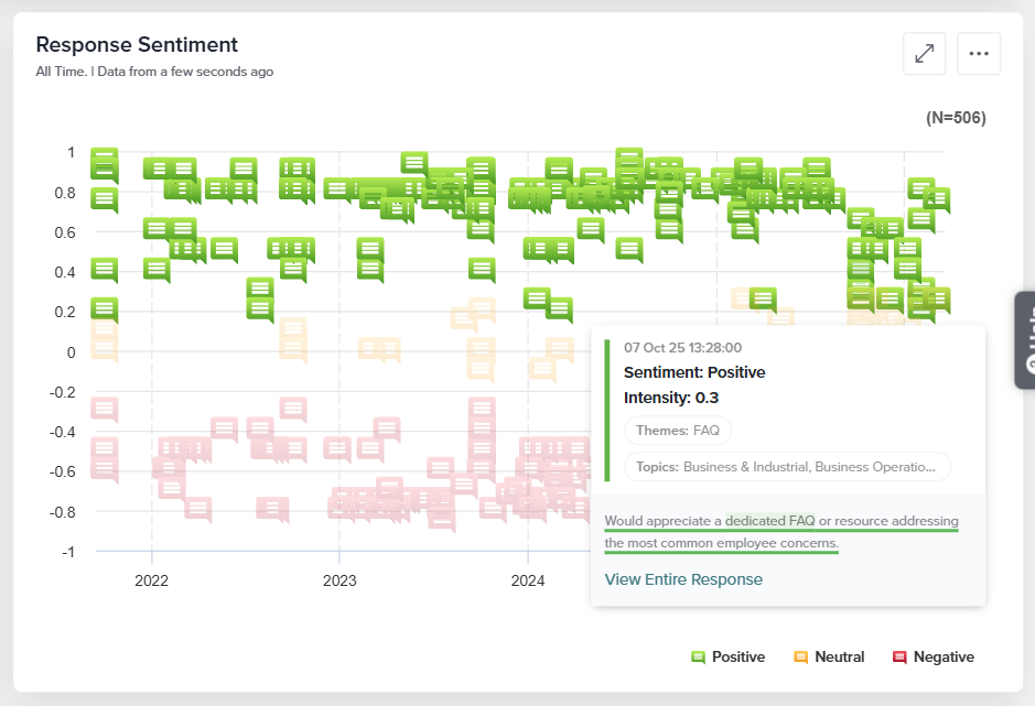
This widget shows response distribution over time, categorized as Positive, Neutral, or Negative. Hovering over a sentiment displays intensity, themes, topics, and the response text. The three-dot menu allows sharing, downloading, or refreshing the data. This widget can be downloaded as a PDF or an image file(png and jpeg).
Responses
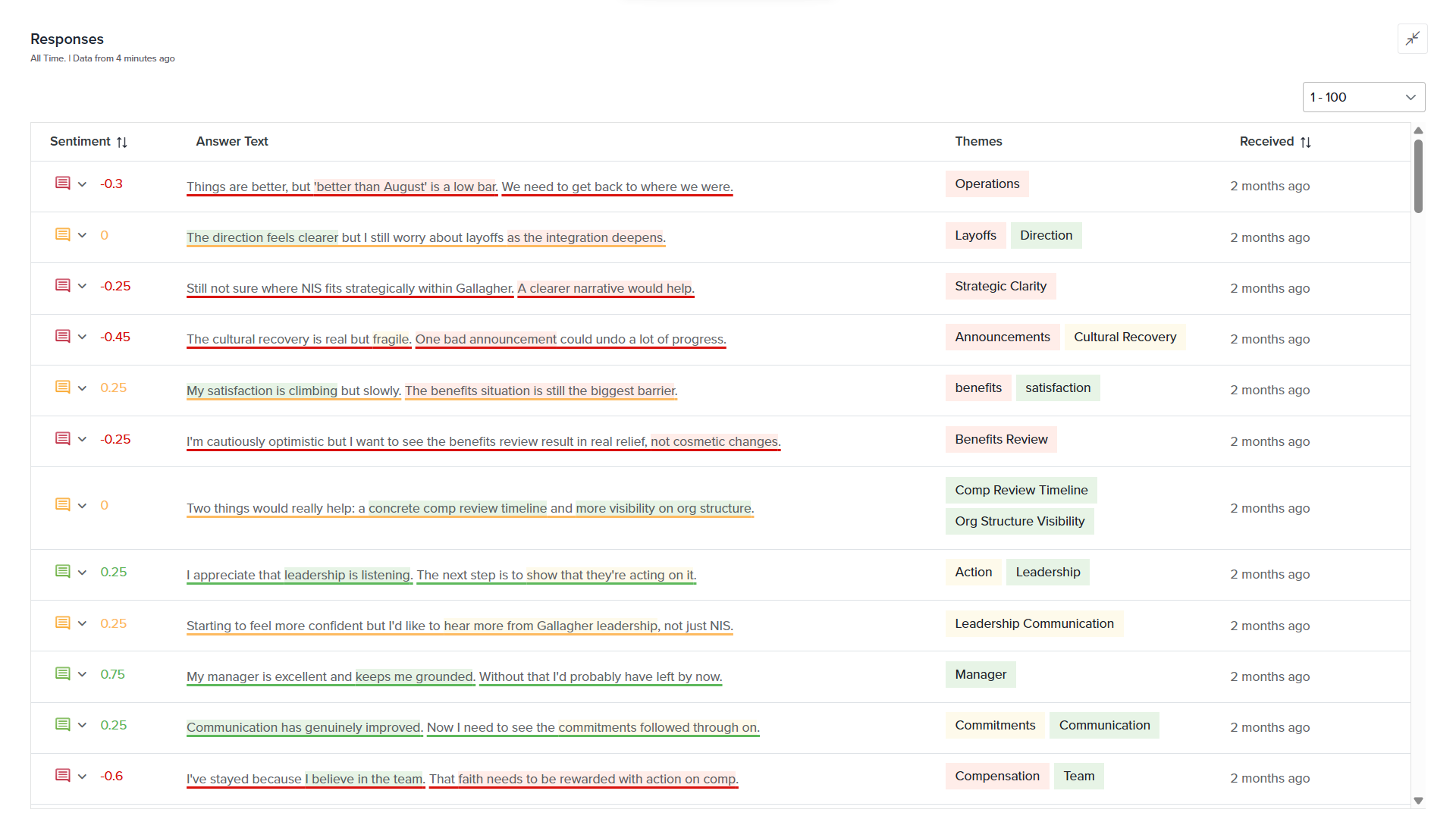
All open-ended responses are displayed in a table showing sentiment, themes, and response date. You can update the sentiment of a response using the dropdown in the Sentiment column. The three-dot menu allows column customization, sharing, downloading, or refreshing data. This widget can be downloaded as a PDF or an XLSX file.
Theme Analysis
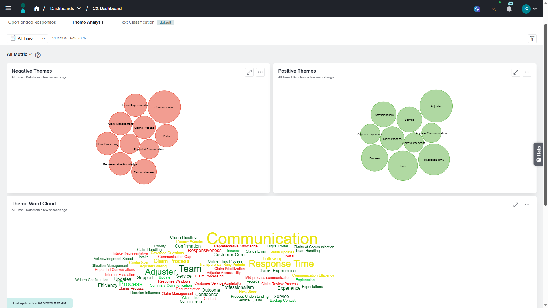
Theme Analysis identifies recurring topics discussed in open-ended responses by analyzing language patterns and detecting common keywords and phrases. These topics, known as themes, help organizations understand what respondents are talking about most frequently. In addition to identifying themes, the report also detects the emotions associated with those themes. While themes indicate the subject being discussed, emotions reveal how respondents feel about that subject.
“The documentation was easy to follow, but the response time from support was too slow. Overall, I am satisfied with the product, although the delays were frustrating.”
From this response, the system may identify:
- Themes: Documentation, Response Time
- Emotions: Satisfaction, Frustration
In this example, the themes represent the topics being discussed, while the emotions represent the respondent’s feelings toward those topics. Together, themes and emotions provide a more complete understanding of respondent feedback.
Available Widgets in this tab
Negative Themes
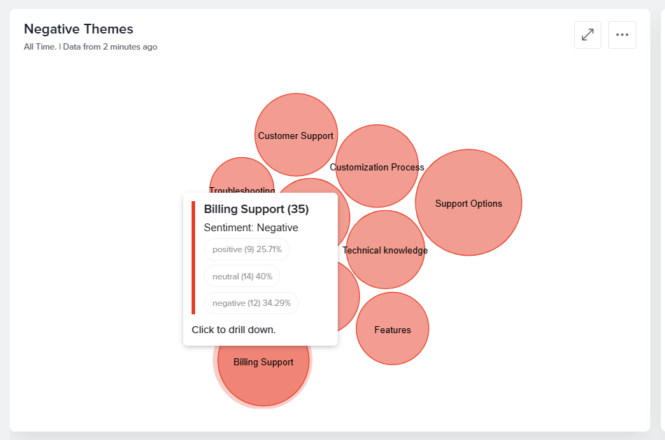
Displays themes that are most frequently associated with negative feedback using a Pack Chart. Larger circles represent themes that appear more frequently across responses. Clicking on any circle from the pack chart allows you to drill down further regarding that particular theme. It displays the Emotion and theme word cloud associated with that word along with its Response Sentiment and associated Responses.
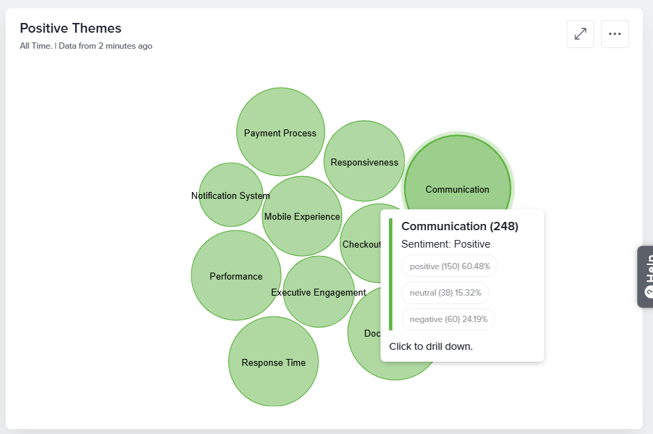
Positive Themes
Displays themes that are most frequently associated with positive feedback using a Pack Chart. Larger circles represent themes that appear more frequently across responses.
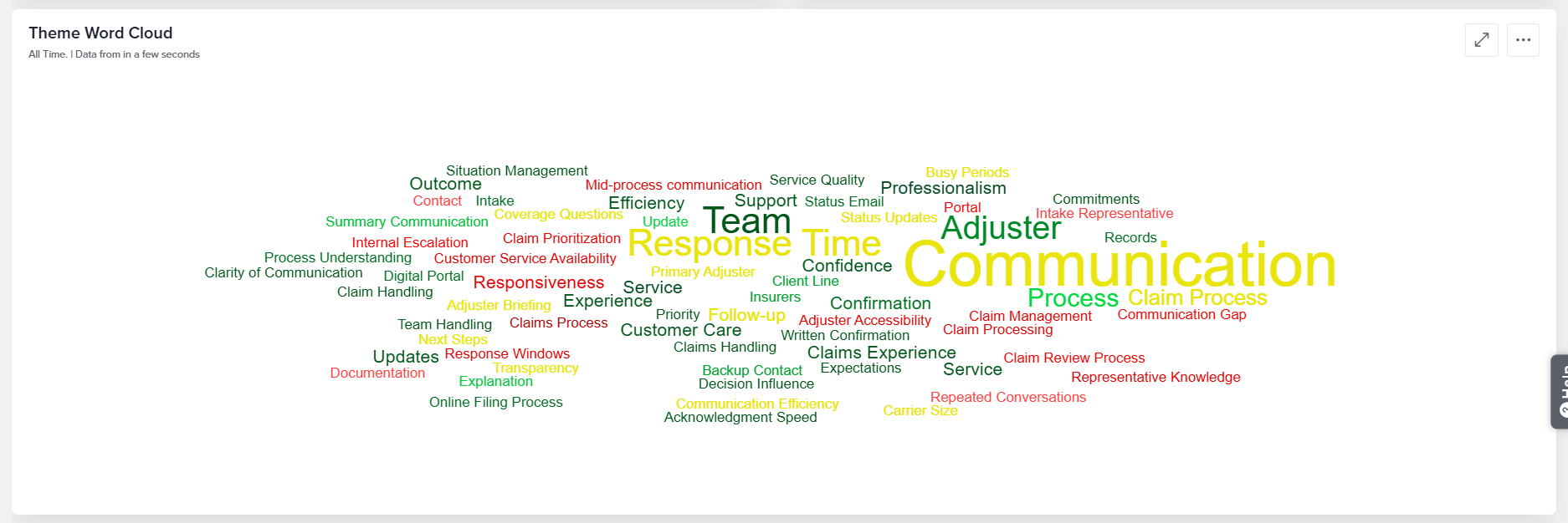
Theme Word Cloud
Displays all identified themes in a Word Cloud. The size of each word corresponds to how frequently that theme appears within the analyzed responses.
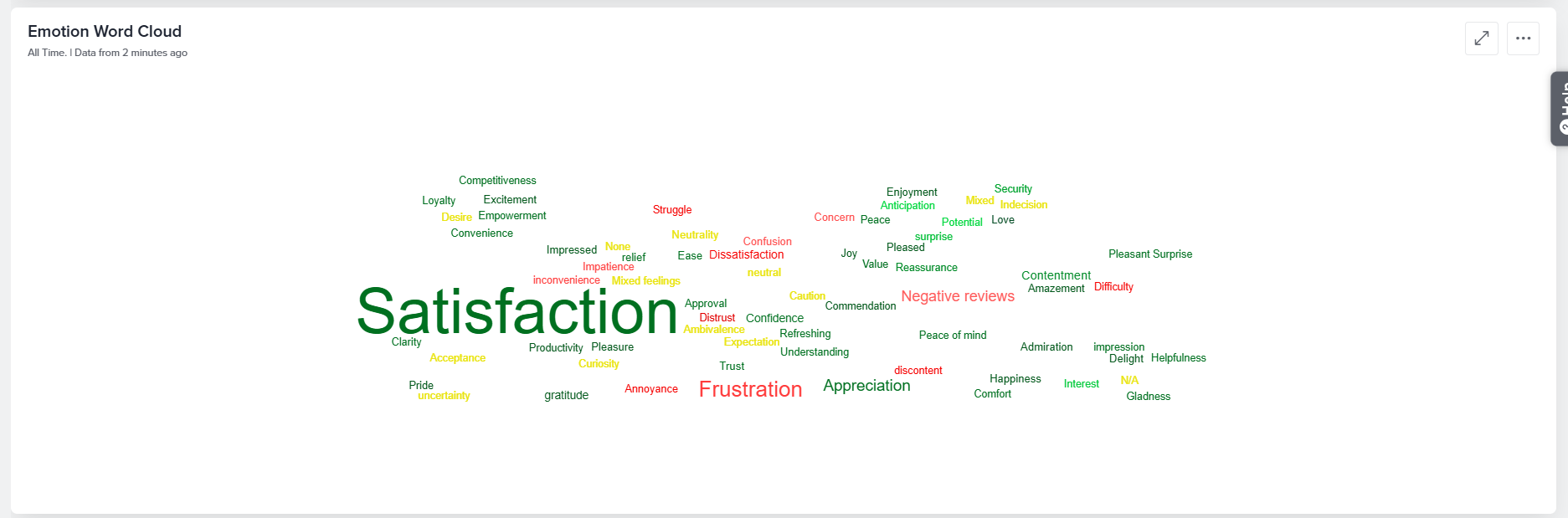
Emotion Word Cloud
Displays the emotions detected across all analyzed responses in a Word Cloud. The size of each emotion corresponds to how frequently it appears within the feedback.
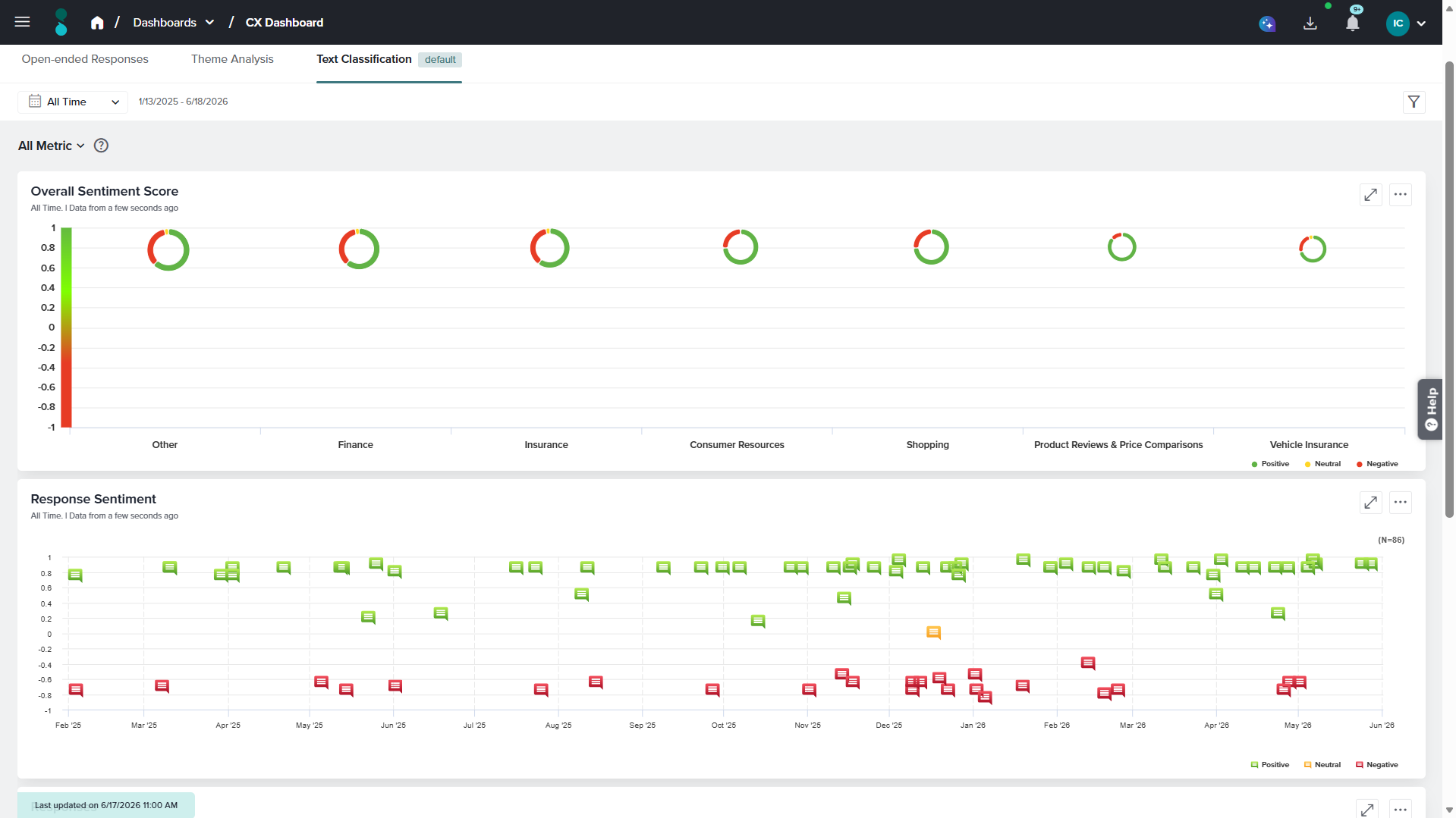
Text Classification
The Text Classification tab is the default view that provides key insights into your open-ended responses. The data displayed here is generated independently and does not rely on AI services.
Available Widgets in this tab
Overall Sentiment Score
The Overall Sentiment Score widget, displayed in the top-left corner, shows sentiment distribution using a Donut chart categorized into Positive, Neutral, and Negative. Hovering over a sentiment reveals the total number of responses, percentage share. This responses in this widget are classified into various topics identified by the system. Hover over any of the sentiment donut to view the following details:
- Number of responses categorized within the topic
- Mean sentiment
- Median sentiment
- Number and percentage of positive responses
- Number and percentage of negative responses
- Number and percentage of neutral responses
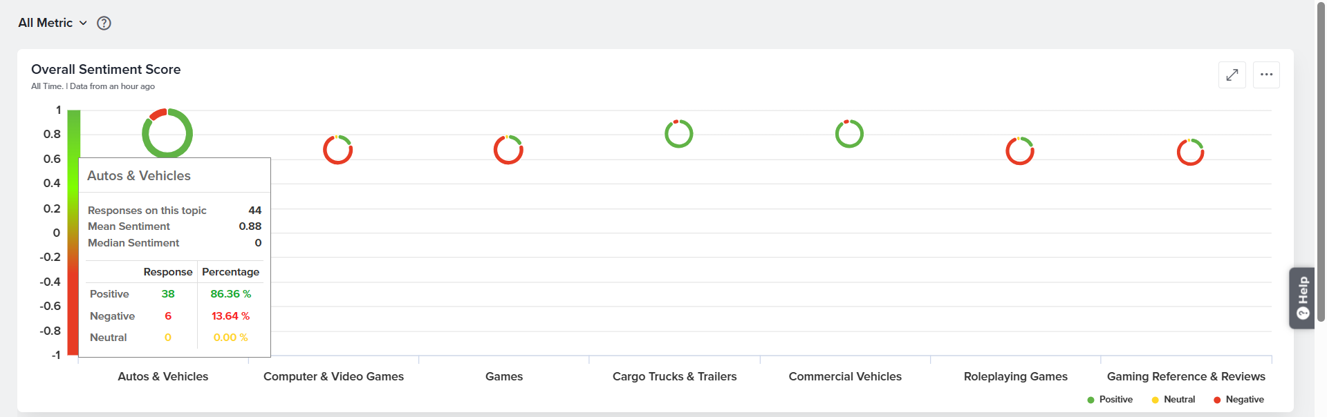
A maximum of 7 topics will be displayed in this widget.
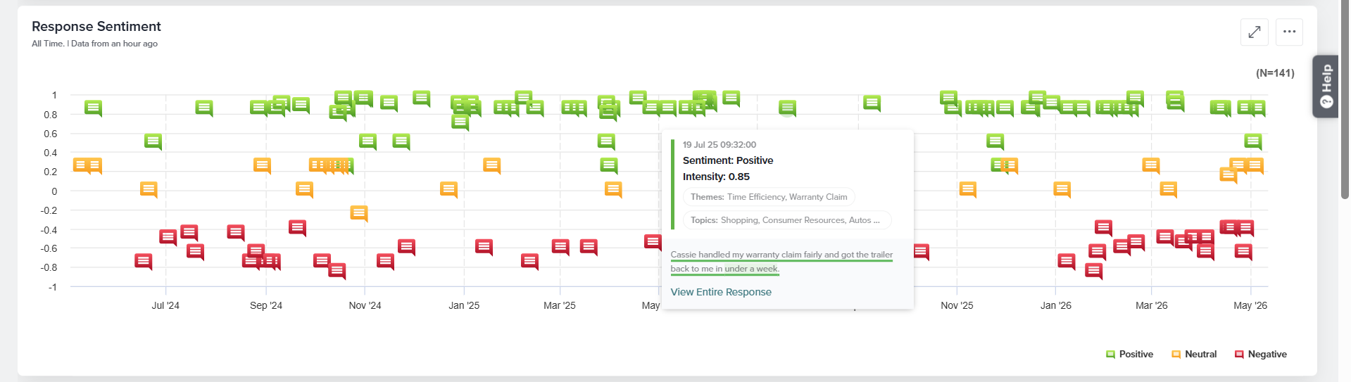
Response Sentiment
This widget shows response distribution over time, categorized as Positive, Neutral, or Negative. Hovering over a sentiment displays intensity, themes, topics, and the response text. The three-dot menu allows sharing, downloading, or refreshing the data.
Responses
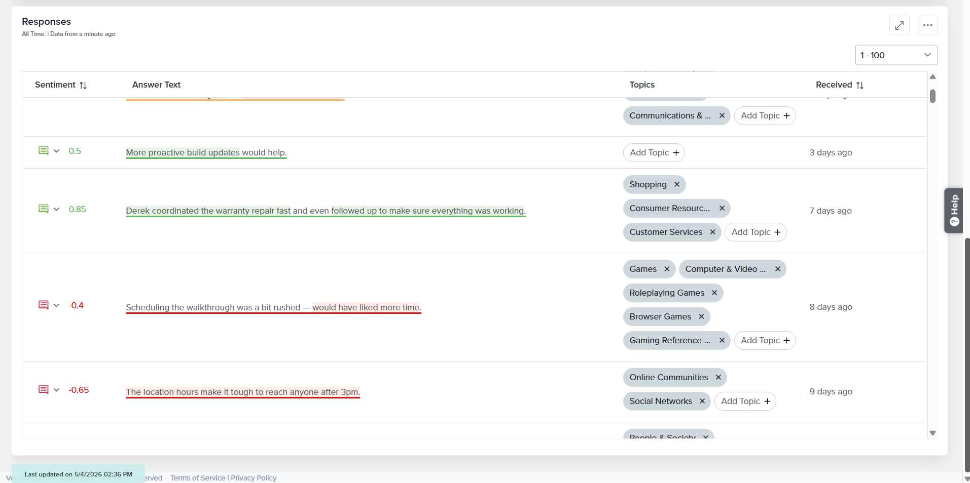
This table displays all open-ended responses along with their associated sentiment, identified topics, and the date and time each response was received.
The sentiments and topics are automatically analyzed and assigned by the system. If you believe any sentiment or topic has been categorized incorrectly, you can update it manually. Sentiment can be modified using the dropdown menu next to the sentiment score in the response table. Additional topics can also be added from the system-generated predefined list by clicking Add Topic. The three-dot menu provides options for column customization, sharing, downloading, and refreshing the data.
Sogolytics also offers the capability to train custom models tailored to your organization’s specific Text Analysis reporting requirements. To learn more about this option, please contact your account manager or reach out to our Customer Support team.
Filters
The controls at the top of the Text Analysis tabs let you refine the data shown across the Open-Ended Responses, Theme Analysis, and Text Classification views.
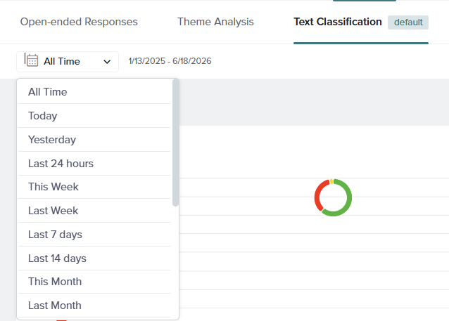
All Time Filter
The date range filter, located in the top-left corner, controls the time period for which data is displayed. By default it is set to All Time, and the exact date range currently in effect is shown next to the dropdown (for example, 1/13/2025 – 6/18/2026).
Click the dropdown to choose from the available preset ranges, including All Time, Today, Yesterday, Last 24 hours, This Week, Last Week, Last 7 days, Last 14 days, This Month, Last Month, Last 30 days, This Quarter, Last Quarter, Last 90 days, Last 180 days, This Year, Last Year, Last 12 Months, Custom(define your own start and end dates).
Metric Filter
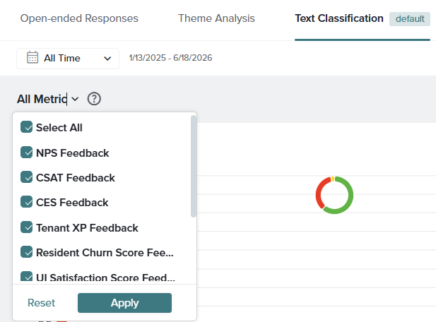
The metric filter, labeled All Metric by default, lets you focus the analysis on feedback collected from specific metric (follow-up) questions in your project. Click the dropdown to see the full list of available metrics, each with a checkbox.
Use the checkboxes to include or exclude individual metrics, or select Select All to choose every metric at once. The controls at the bottom of the dropdown work as follows:
- Apply: Saves your selection and updates all widgets on the tab to show only the chosen metrics.
- Reset: Clears your current selection and returns the filter to its default state.
Filters
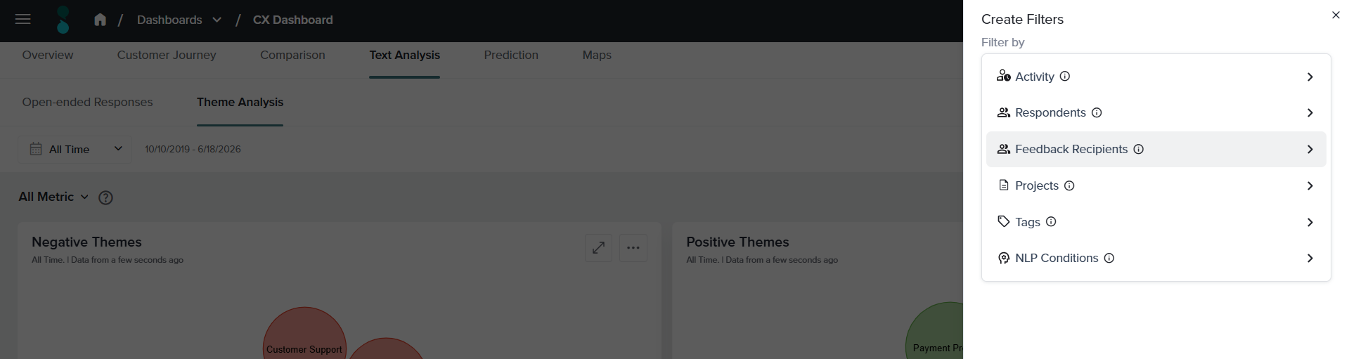
The filter icon in the top-right corner opens the Create Filters panel, where you can build more detailed conditions to segment your feedback. Filters can be combined to drill down into specific groups of responses across all Text Analysis widgets.
You can filter by the following:
- Projects: Displays responses collected through the selected project(s).
- Activity Fields: Displays responses associated with records that match the selected activity field criteria.
- Respondents: Displays responses submitted by the selected respondent(s).
- Feedback Recipients: Displays responses associated with the selected feedback recipient(s).
- Tags: Displays responses associated with the selected tag(s).
- NLP Conditions: Displays responses submitted only for the specified NLP Condition.
Select a category to define its conditions, then apply the filter to update the dashboard. Applied filters remain active until you remove or change them.
Filters applied to a tab affect only the widgets within that tab and do not carry over to other tabs.
Good To Know
- The Open-ended Responses and Theme Analysis services rely on the use of OpenAI’s API, which is a non-Sogolytics application. These analyses are available only if you agree to the OpenAI Terms.
- Only data you choose to share is processed through OpenAI APIs.
- Your data is not used by OpenAI to train its models.
- OpenAI may store data or information sent or received using this service for a period of up to 30 days.
- Sogolytics has executed a Data Processing Addendum with OpenAI.
- Neither Sogolytics nor OpenAI is liable or responsible for your use of this service, including but not limited to content that is generated, modified, or received, by you through the use of this service.
- For more information on OpenAI’s practices, please see: (i) Enterprise Privacy at OpenAI and (ii) Data Processing Addendum.
See also
Subscribe for tips and insights to drive better decisions!