

CX Dashboard: Overview
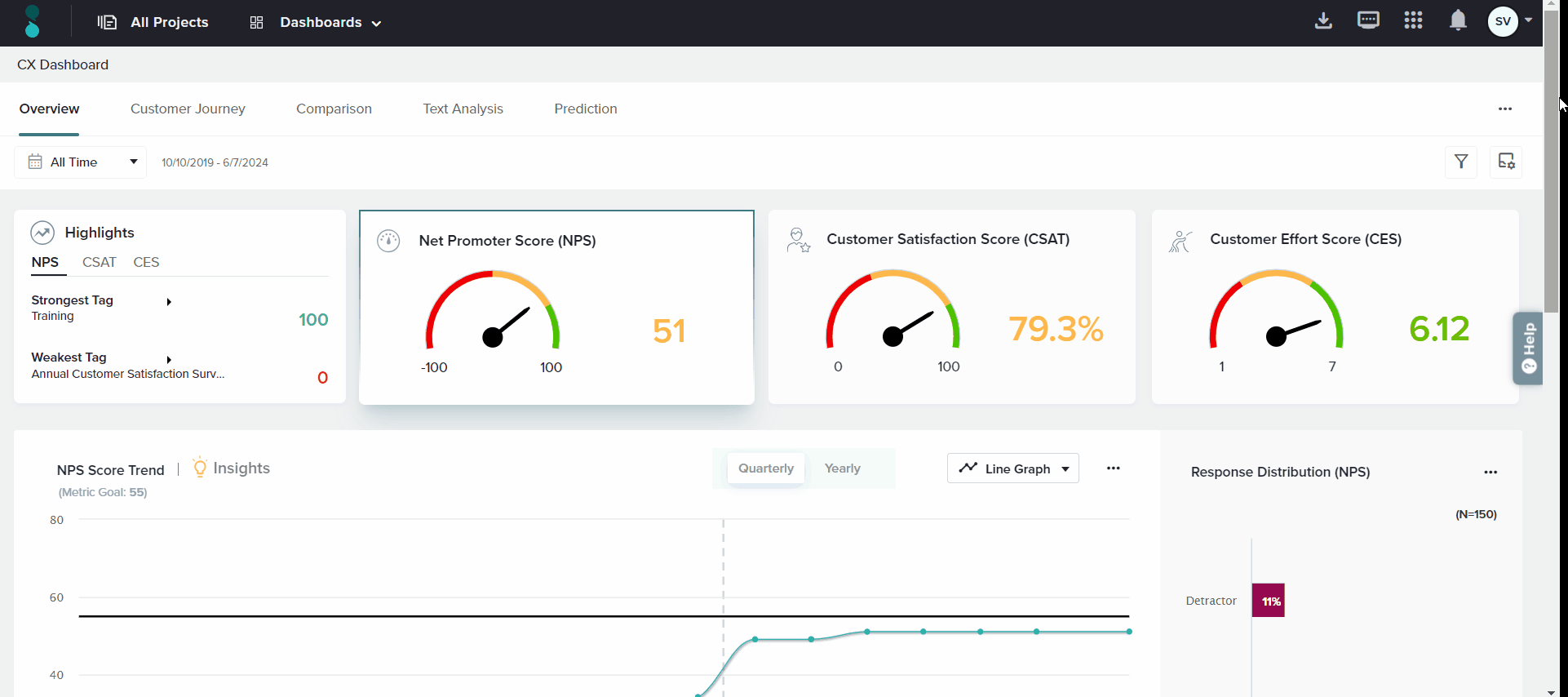
The CX Dashboard Overview makes it easy to track your core business metrics. Choose to display Net Promoter Score (NPS), Customer Satisfaction Score (CSAT), Customer Effort Score (CES), and any Custom Metrics you have created.
Within the Overview section of the CX Dashboard, you’ll see trend graphs and response distribution for your key selected CX metrics, strong and weak Tags, and insights on Key Drivers impacting your metrics.
By default, the Overview section will show data received from all CX metric questions with Tags applied. To modify the display, you may choose to Manage Time, Manage Metrics, apply Filters, and review Dashboard Settings as needed.
To access the CX Dashboard Overview, click Dashboards in the top bar of the homepage or click on the menu icon in the top left corner of any other screen.
Navigate to
Time Period
By default, the Overview displays data from All Time. To view data from a specific time period, select options from the time period dropdown. This selection impacts all data displayed below on the Overview tab.
This dropdown is located in the top left of the Overview section.
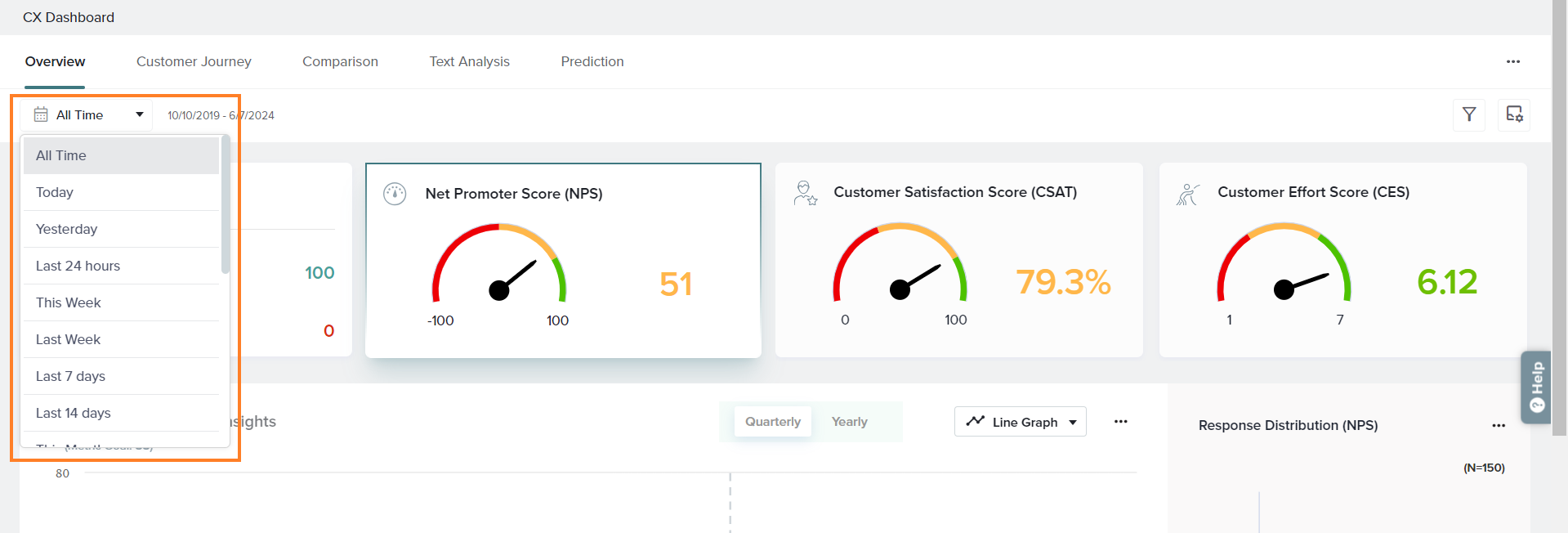
Choose from the following options:
- All Time: Shows all data received, from the first response to the present.
- Today: Shows data from responses received on the current date.
- Last 24 hours: Shows data from responses received within the last 24 hours.
- This Week: Shows data from responses received during the current week (Monday to Sunday).
- Last 7 days: Shows data from responses received within the last 7 days, up to and including the current date.
- This Month: Shows data from responses received in the current month, up to and including the current date.
- Last Month: Shows data from responses received in the previous month.
- This Quarter: Shows data from responses received this quarter, up to and including the current date.
- Last Quarter: Shows data from responses received in the previous quarter.
- Last 30 days: Shows data from responses received in the last 30 days, up to and including the current date.
- Last 90 days: Shows data from responses received in the last 90 days, up to and including the current date.
- Last 180 days: Shows data from responses received in the last 180 days, up to and including the current date.
- Year till date: Shows data from responses received in the current calendar year, up to and including the current date.
- Last 365 days: Shows data from responses received in the last 365 days, up to and including the current date.
- Last year: Shows data from responses received in the previous calendar year.
- Custom: Shows data from the selected time period.
The default time period displayed is ‘All Time’.
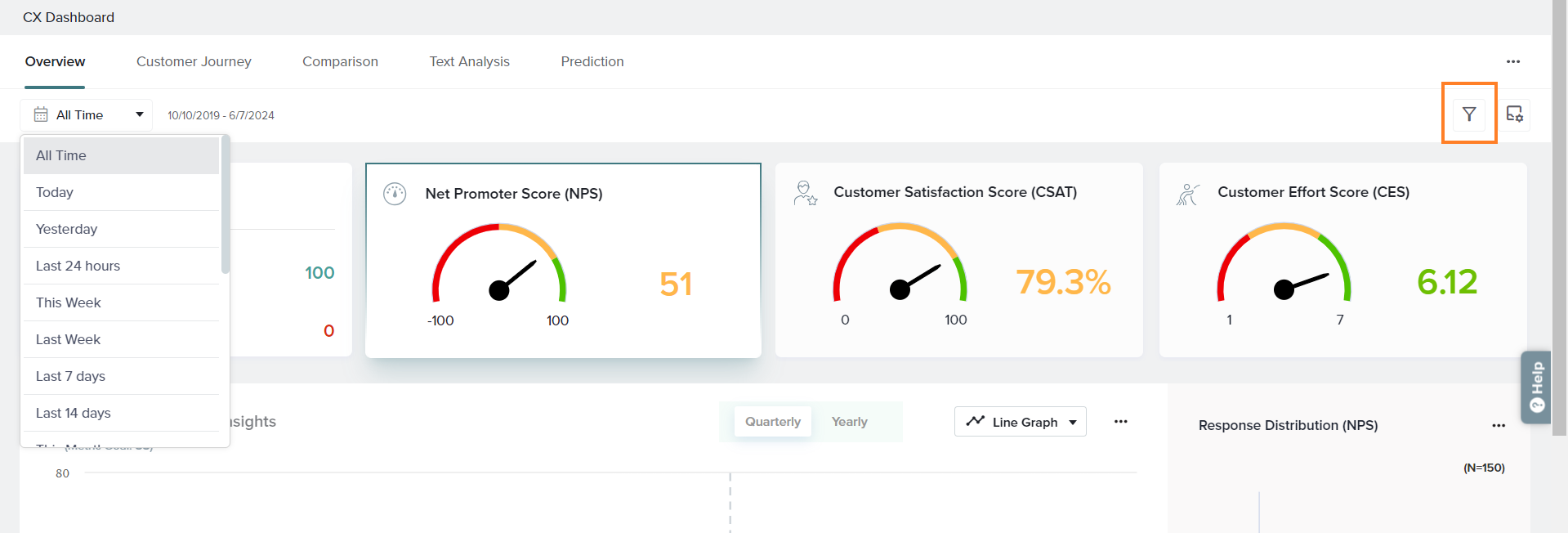
Filters
In addition to time period, you may choose to drill down on results from specific data sets. You may set up filters based on the following:
- Projects: Analyze your data based on specific CX projects rather than all CX projects.
- Tags: Filter based on specific Tags applied to CX projects.
- NLP Conditions: Filter data based on analysis of open-ended questions marked as CX follow-up questions. Choose to filter by Sentiment, Theme, Topic, Emotion, Language and answers provided to the Metric questions.
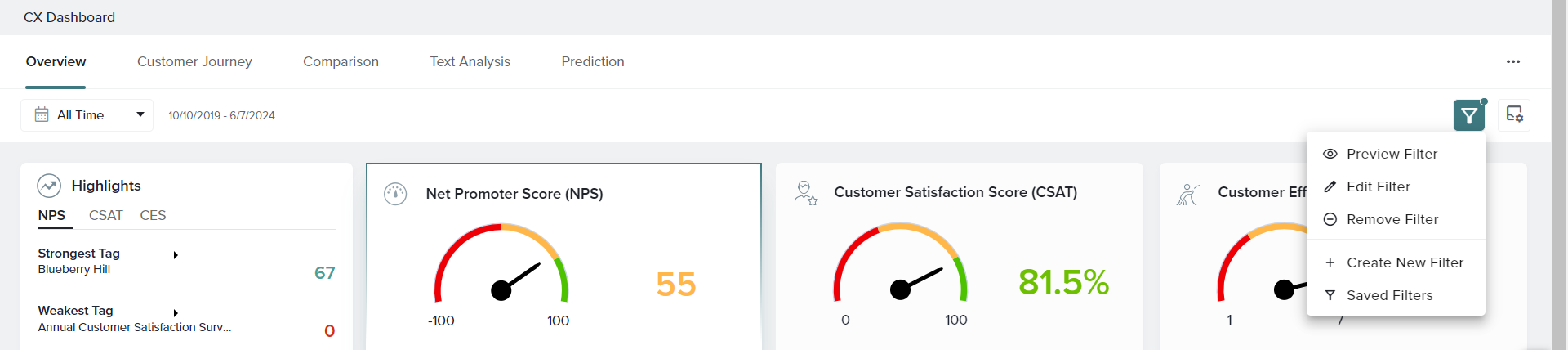
Access filters from the funnel icon in the top right of the Overview tab.
Create a Filter
- Click the filter option in the top right of the Overview tab.
- Select your conditions from the options displayed.
- When ready, choose to Apply or Save and Apply your filter.
Manage Filters
- If you have saved filters but none are applied, clicking on the filter option shows all saved filters. Hover to display options to preview or apply the filter. You may also click the three-dot menu to edit, duplicate, rename, or delete the saved filter.
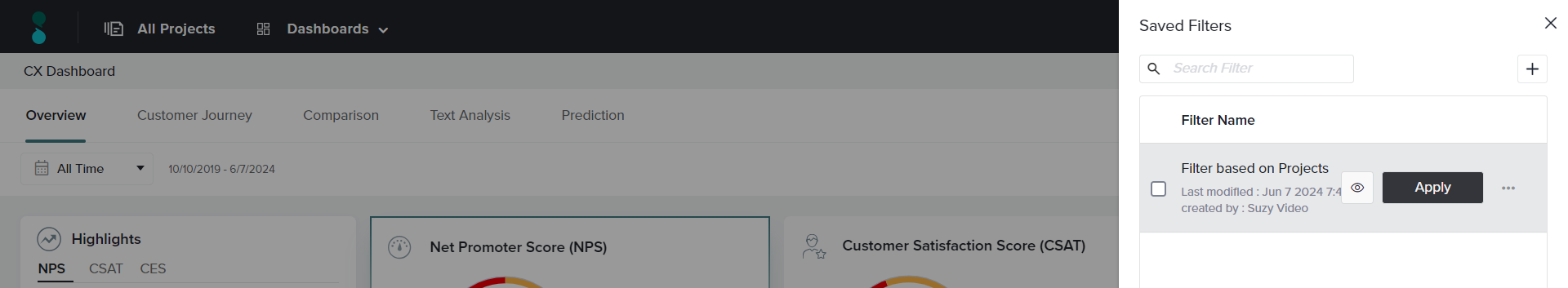
- If you have applied a filter, hovering over the filter icon will show options to preview, edit, or remove the applied filter. From here, you may also create a new filter or access saved filters.
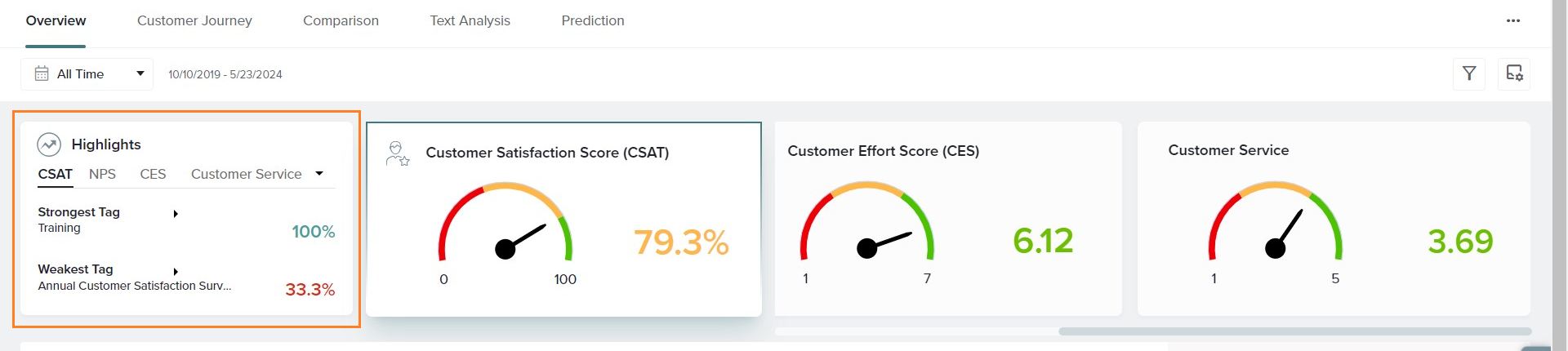
Manage Metrics
Whether it’s Net Promoter Score (NPS), Customer Satisfaction Score (CSAT), Customer Effort Score (CES), or your own Custom Metric, choose to showcase the data that matters most to you.
Click the Manage Metrics icon in the top right corner of the Overview tab. From here, pick the metric or metrics to display, and apply your choice. If you don’t see a specific metric listed here, check your Dashboard Settings.
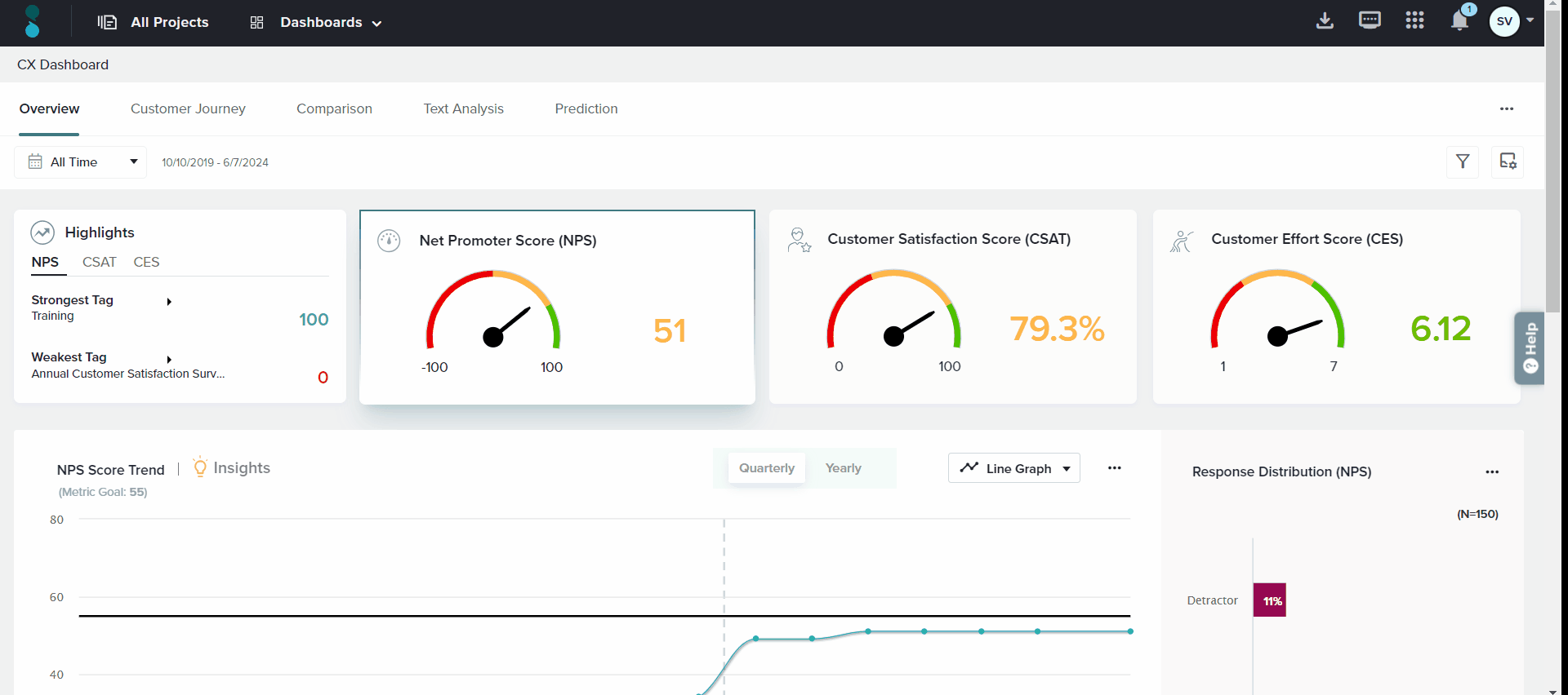
Highlights
This section provides a real-time look at the strongest and weakest Tags for each of your core CX metrics, either overall or from selected Categories. Learn more about Highlights.
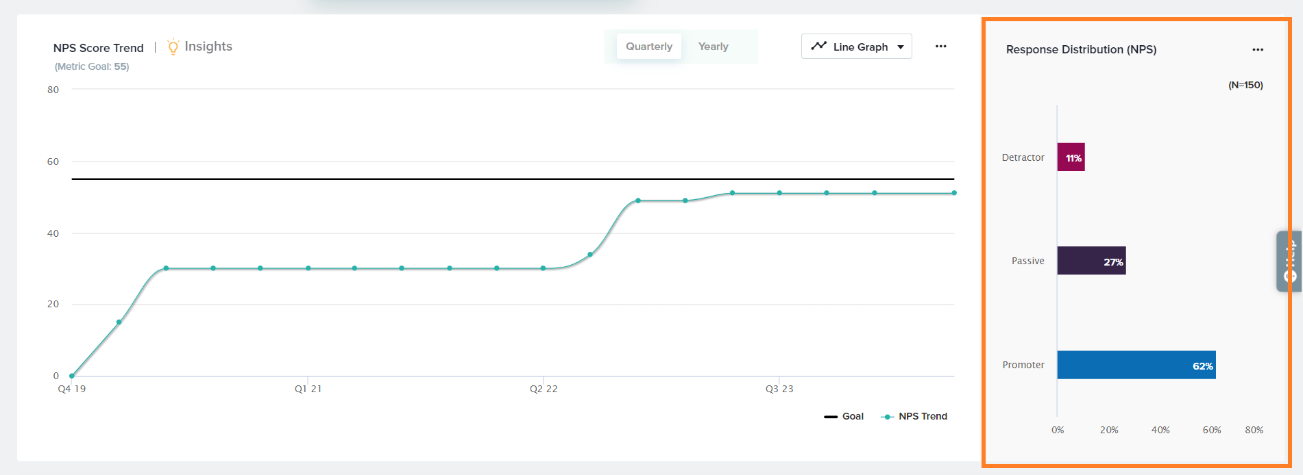
Score Trend Graphs
This section displays trends in your most important CX metrics, as selected under Manage Metrics. Click on the relevant score card on the top of the Overview to review data from each metric separately.
For example, clicking on Net Promoter Score (NPS) will update the data below, including the Score Trend, Response Distribution, and Key Driver Insights – all based on NPS.
Score Trend Display Options
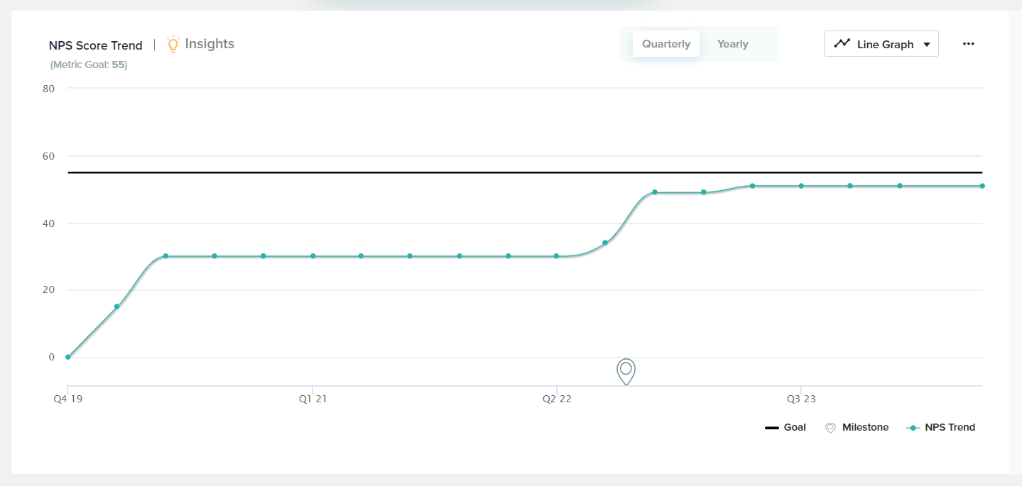
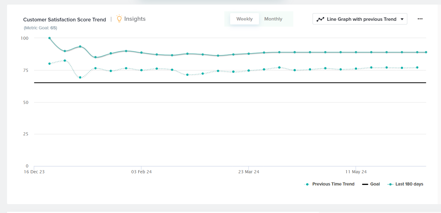
By default, Score Trend data is displayed in a line graph format. Modify your display with the following options:
- Time Period: Choose whether to display your trend by quarter or year.

- Scale Range: Display the scale as Original Range or Best Fit by choosing Scale Range under the three-dot menu.
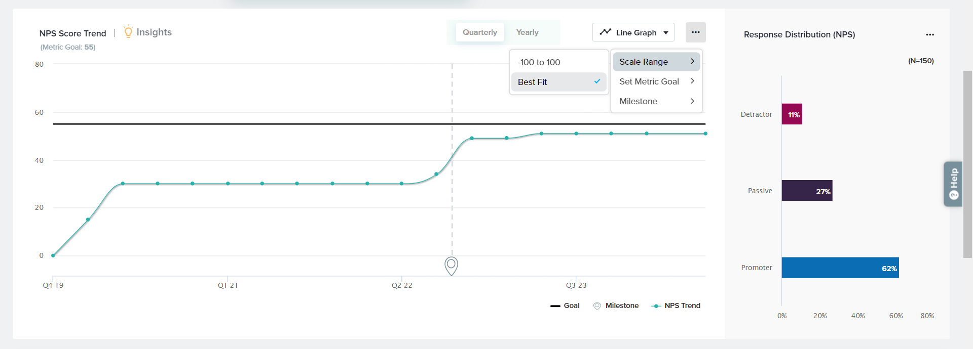
- Goal: Choose to display a goal to easily review how close you are to your target score. To set a Goal, click on the three-dot menu, Set Metric Goal, and enter your goal value.
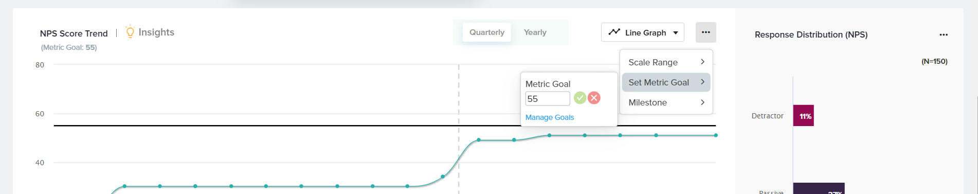
- Milestone: Set Milestones for important events or changes to review any impact they may have had on your metrics. To set a Milestone, click on the three-dot menu and select Milestone.
- Previous Trend Comparison: If your selected time period is anything other than All Time, you’ll see the option to display a line graph that includes two trends: one for the selected time period and one for the previous equivalent time period, as defined in the time period dropdown. For example, if you select Last Year, you’ll see both data from last year (line) and the year prior (dotted line). If you select This Week, you’ll see both data from this week (line) and last week (dotted line).
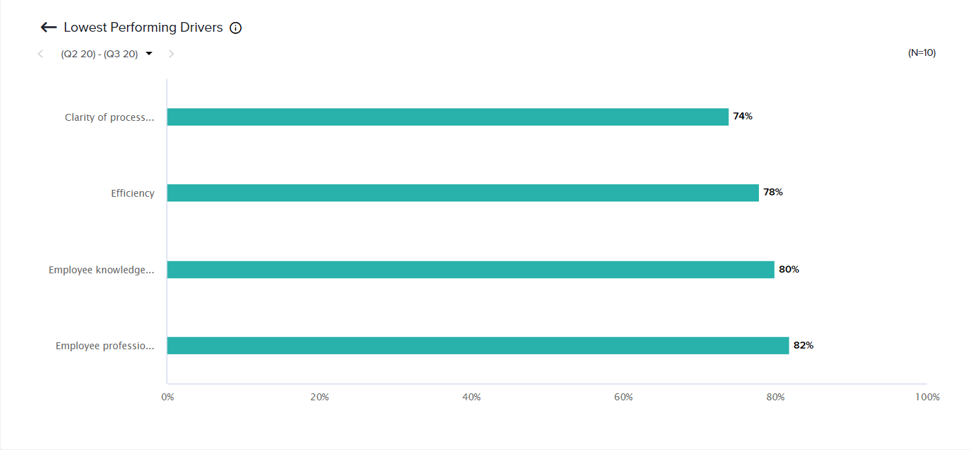
- Insights: This section displays the lowest-performing Drivers for the selected metric. To access this view, click the light bulb icon next to Insights in this section. Learn more about Drivers.
Response Distribution
View response distribution according to answer categories for each metric. You may also customize the graph type, color, and labels.
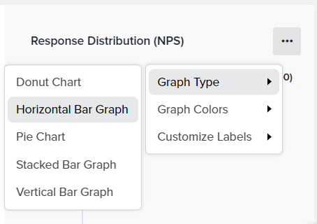
Customizing Response Distribution
To customize the Response Distribution display, click on the three-dot menu in the top right corner of this section. Review and select from the following options:
- Graph Type: Choose from Horizontal Bar Graph, Vertical Bar Graph, Stacked Bar Graph, Pie Chart, and Donut Chart.
- Graph Color: Choose your preferred color palette.
- Customize Labels: Merge, hide, and rename graph labels.
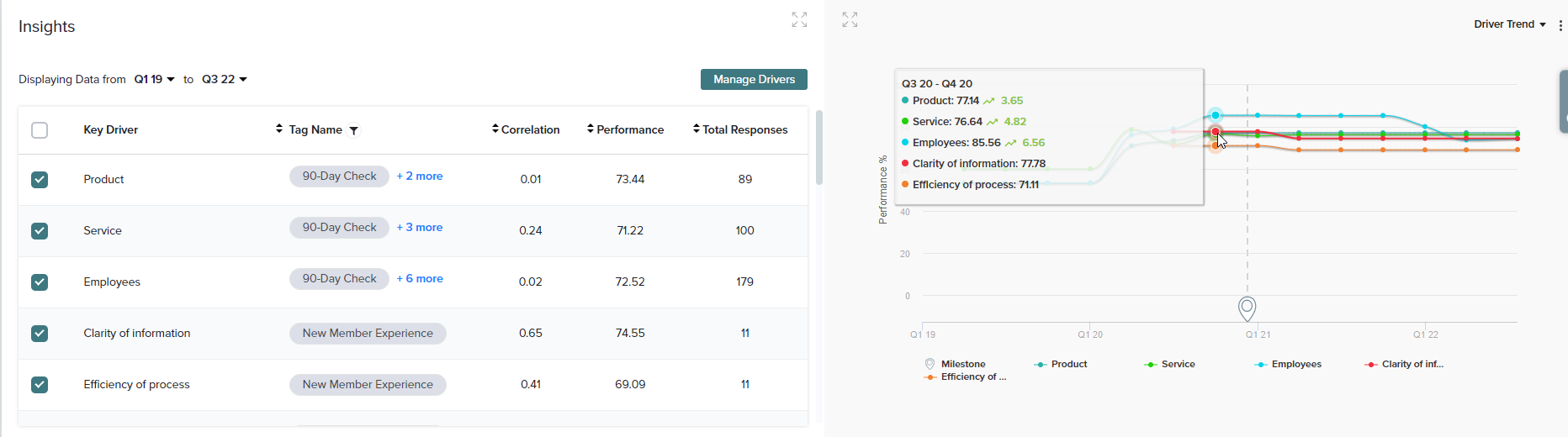
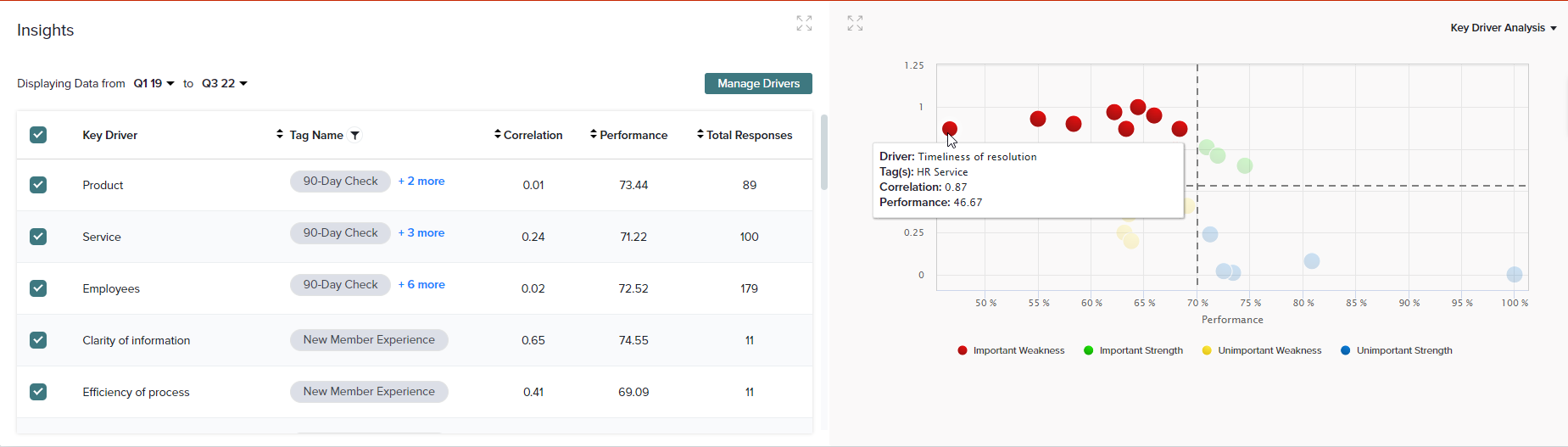
Driver Insights
For a deeper understanding of what’s impacting the performance of your CX metrics across Tags, view the Insights section and drill down on important Drivers. Understand what matters the most to your customers and what should be your top priority.
Under the Insights section at the bottom of the Dashboard, you’ll be able to view the performance of selected Drivers based on the selected Tags.
On the left side of this section, you can customize the time period and manage drivers. Check and uncheck Drivers from this table to display/hide each from the chart on the right.
On the right, choose from two views to see results from the selected Drivers and timeframe.
- Driver Trend: This chart tracks the performance of up to 5 selected drivers across the chosen time period.
- Key Driver Analysis: This chart breaks down selected Drivers into quadrants to identify those that are most closely correlated to your customers’ ratings. As a result, this chart helps you to identify and prioritize the greatest opportunities to improve your customers’ experience. Click here to learn more about Key Driver Analysis.
Learn more about how to add drivers to your Dashboard.
Subscribe for tips and insights to drive better decisions!