




A download is the easiest number to celebrate, and one of the least useful. Marketing drives installs, the chart climbs, and then most of those users never open the app again. For a team that owns a banking app, the real work starts after the install. The stretch between download and daily use is where adoption is won or lost.
This article looks at adoption as a funnel with five steps: sign-up, first login, finding what you need, reliability, and a reason to come back. Some users drop off at each step. The teams that do well simply lose fewer people at each one. Three ideas run through the whole piece. App-store ratings can look great while adoption is failing. Customer effort is the number that shows you the real problem. And the fix is usually a stuck step rather than a missing feature.
Why Good Ratings Can Hide the Problem
Most teams watch their app-store rating and an ease-of-use score. Both can look fine while adoption stalls. Here is why. An ease-of-use score tells you how the app feels to people who already use it, and says nothing about the people who gave up before they got that far.
A banking app can be pleasant to use and still lose most of its downloads. The losses happen early: at sign-up, at the first login, and at the first real task. A survey of active users never sees those people. To find the stall, measure effort at each step instead of measuring satisfaction as one big average.


Effort matters because it predicts loyalty better than satisfaction does. In Sogolytics’ banking research, the bank whose customers reported the most effort also had the largest share of customers ready to switch. Hard-to-use apps and customer loss tend to show up together. When an app is hard to use, it actively pushes people to leave.
The Five Places Where Adoption Stalls
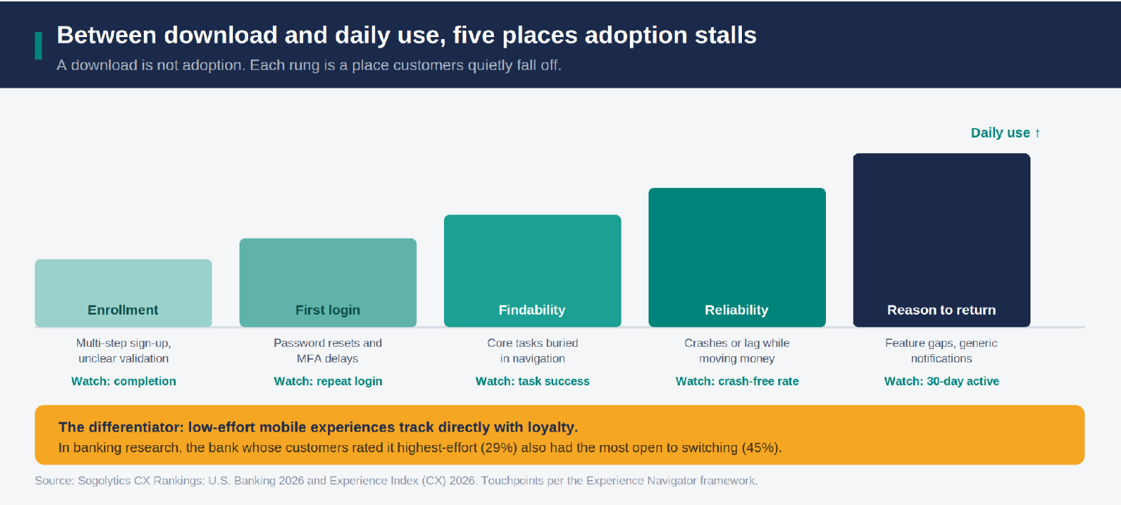
Adoption tends to fail at five points. Strong teams do not start with more downloads. They keep more of the people they already have, because they treat each step as something to measure instead of assuming the app just works.
Sign-up
The first-time sign-up is often long. Fields are unclear, people are not sure if they got it right, and many give up before they ever log in. Strong teams break sign-up into small steps, check each field as the user types, and clearly confirm when the account is ready. Watch your sign-up completion rate.
First login
A forgotten password or a slow security code is annoying once and infuriating every day, and it is the single biggest reason people stop using an app. Strong teams make login quick, allow fingerprint or face sign-in, and avoid forcing password resets. Every bit of login friction is a session you lose. Watch your repeat-login rate.
Finding the main tasks
New users often cannot find the things they came to do, like transfers, paying bills, or depositing a check. The menu was built by people who already know where everything is. Strong teams put the few most-used tasks up front and guide first-time users to them. Watch task success on your top journeys.
Reliability when money moves
A freeze or a crash while someone deposits a check or moves money does not feel like a small bug. It feels like a reason to doubt the app with their money, and one bad moment like that can end their use for good. Strong teams make money-movement screens the most stable part of the app and track that on its own. Watch the crash-free rate on money actions, not the app overall.
A reason to come back
Even a solid app stalls if it gives people no reason to open it between payments. Missing features that the website has, plus generic push alerts, teach people to ignore it. Strong teams add the features that matter and send alerts that save time or meet a real need. Watch your 30-day active rate.
Adoption Looks Different Across Your Members
It is easy to read one adoption number and assume every customer is the same. They are not. Sogolytics research shows that while digital channels now lead in every age group, older customers still lean on the branch more, and comfort with logins and self-service varies a lot.
If you push everyone into the app at the same speed, you will strand the people who need more help, and it can feel like pressure instead of support. Strong teams look at adoption by group, see where each group gets stuck, and offer help along the way, like guided demos or a staff member who can walk someone through a first login. Moving people to the app works best when you meet them where they are.
Use Personalization to Save People Time
When teams reach the fifth step, the instinct is to add personalization, and this is where many go wrong. People assume personalization drives engagement, but the research is humbling. Only about one in six customers call it a priority, and how happy people are with the personalization they get trails well behind how much they say it matters.
Customers do not want more targeted ads inside their banking app. They want routine tasks to go faster. That fits what drives switching across financial services, where ease and reliability beat novelty.
The useful version of personalization is narrow. It means showing the payment someone makes every month, warning about a low balance before an overdraft, and remembering the transfer they run every payday. Each of those removes work, and that is what earns daily use. Personalization used to push offers tends to backfire, because people mute the alerts and you lose the one channel you had for building a habit.
The Parts of the Journey That Are Not the App
Adoption is not only a product problem, which is easy to forget on a mobile team. The Experience Navigator mapping is a useful reminder that the path into the app runs through touchpoints the product team does not own. The sign-up workflow might send a confusing confirmation. Branch staff often feel unsure explaining digital features, printed statements can bury the sign-up prompt, and phone support may handle app problems differently each time.
A team that fixes the app but ignores these hand-offs will still see adoption stall, because the customer’s path to daily use crosses all of them. A consistent experience across channels matters as much as a clean app on its own.
The Adoption Funnel After Download: Five Differences
| Step | Where it stalls | What strong teams do | What to watch |
|---|---|---|---|
| Sign-up | Long sign-up with unclear fields, so users drop before first login | Small steps, checks as you type, clear success confirmation | Sign-up completion |
| First login | Password resets and slow security codes discourage repeat use | Quick login, fingerprint or face sign-in, few forced resets | Repeat-login rate |
| Finding tasks | Core tasks buried in a menu built by insiders | Top tasks up front and a guided first run | Task success |
| Reliability | Freezes or crashes while depositing or moving funds | Make money screens the most stable part, tracked on their own | Crash-free money actions |
| Reason to come back | Missing features and generic alerts train users to ignore the app | Add the features that matter, send time-saving alerts | 30-day active rate |
Steps and touchpoints drawn from the Experience Navigator mapping of digital banking adoption.
How One Credit Union Found its Stall
HealthShare Credit Union, based in North Carolina and serving 4,500 members since 1955, ran into this exact problem. When it launched a new mobile banking app, the team wanted to know a simple thing: were members using it, and how did they feel about it?
Their first attempt to measure adoption used SurveyMonkey, but participation was so low that the data could not be trusted, and they had to drop the project. Without reliable feedback, HealthShare could not tell whether members were using the app or understand their banking habits. That left the whole adoption goal stuck.
HealthShare moved to Sogolytics and rebuilt the survey with Net Promoter Score and question display logic, so each member saw follow-up questions that fit their answers. Sent by email, the surveys brought back usable feedback within the first month. The response rate reached 30 percent, and members rated their overall satisfaction at 9.45 out of 10.
The bigger win was what the feedback made possible. With a clear read on who was using the app and who was not, HealthShare ran targeted awareness campaigns and built member education around the gaps: short video tutorials, wallet-sized instruction cards, and new material on how secure and convenient the app is. Those steps addressed the same friction the funnel describes, helping members find and trust the app, which supports adoption and keeps members over the long term.
As CEO Genice DeCorte put it: “Within the first 3 months of this project I was seeing results I never experienced or expected, and that made me know Sogolytics was the right choice for our credit union and members.”
Read the full story: https://www.sogolytics.com/case-studies/healthshare-credit-union/
Where This Leaves Product Teams
A download only tells you someone was willing to try. Turning that into daily use means treating adoption as a funnel with five steps you can measure, tracking effort at each one, and working with the channels that feed the app. It also means resisting the urge to answer weak retention with more features, when the real fix is removing friction.
A structured framework like Experience Navigator maps these steps, from sign-up to daily use, and ties each one to the number that exposes it. That is how a mobile team stops guessing and starts fixing the specific step where users get stuck. Start by pulling three numbers this week: your sign-up completion, your repeat-login rate, and your crash-free rate on money actions. The lowest of the three is where your app is losing people.
Practical Takeaways
- Do not trust app-store ratings and overall ease-of-use scores on their own. They measure people who already use the app and miss everyone who stalled before that.
- Measure effort at each step, from sign-up to login to first task to first money movement, so you can see where downloads stop becoming users.
- Treat login friction as a tax on frequency. Make login quick and support fingerprint or face sign-in, because every forced reset costs you daily use.
- Measure reliability on money-movement screens on its own and make it a top priority. A crash while moving money reads as a reason to doubt the app.
- Use personalization to remove work, not to add promotion. The moment it turns into marketing, people mute the alerts and you lose the channel.
A download only signals interest, and that interest hits friction at a few predictable points: a long sign-up, a login that is painful to repeat, a menu that hides core tasks, crashes during money movement, and an app that gives no reason to return between payments. Each problem is small, but together they send motivated users back to the branch, the website, or a competitor.
Track the funnel, not a single score. Sign-up completion, repeat-login rate, task success on your top journeys, the crash-free rate on money actions, and the 30-day active rate together show where users fall off and whether they form a habit. Customer effort at each step is the anchor, because it predicts switching better than overall satisfaction. App-store ratings and general usability scores are the weakest guide, since they only reflect users who already got through.
Only when it reduces effort. Research shows relatively few customers prioritize personalization, and satisfaction with what they get trails behind how much they say it matters. Personalization that surfaces a recurring payment, warns about a low balance, or remembers a routine transfer earns engagement because it saves work. Personalization used to push offers tends to backfire, prompting people to mute alerts and removing the channel you need to build the habit. The test is whether it makes tasks faster.
It is decisive, especially during money movement. A crash or long delay while depositing a check or transferring funds is not read as a minor bug. It raises doubt about whether the customer’s money is safe, and that doubt can end app use outright. This is why strong teams measure the crash-free rate on money actions on their own and treat those screens as the top engineering priority.
Match the level of security to the risk of the action. Support fingerprint and face sign-in and trusted-device recognition, so routine sessions do not demand a full login, save extra verification for higher-risk actions, and limit forced password resets. The goal is to remove friction from low-risk daily use while keeping strong protection where it matters. Blunt, uniform friction is simply poor design that holds down the frequency adoption depends on.
Experience Navigator maps the digital banking journey across sign-up, login, everyday tasks, and support, names the likely friction at each point, attaches the number that exposes it, and recommends the feedback project that measures it, including the touchpoints outside the app that feed adoption. That gives a product team a clear view of the whole path to daily use, so it can find and fix the specific step where users stall instead of guessing from overall ratings.