
Even the most basic survey tool lets you measure responses using a ranking or rating scale. For instance, it’s common to use satisfaction or importance scales (e.g. “very important” to “very unimportant”) or recommendation scales (“How likely are you to recommend us to a friend?”). Sometimes, however, your data analysis can benefit from applying weighted scores to the answers during the design phase.

Why bother with rating questions?
A typical survey includes some kind of qualitative assessment. That is, you ask the respondent to grade a product, experience, or feature on a scale you provide: How important is this? How satisfied were you? How likely would you be to buy this? And that works great, in the large majority of situations.
Generally, when we conduct a survey we’re looking for an overall perception: How happy are our customers, and what can we do to make them happier? It isn’t always necessary to fuss with the details. Keep it simple!
However, in some circumstances, you can make better decisions by weighing the answers.
Perhaps the best explanation is an example used in The Increasing Problem With the Misinformed, which (among other things), uses PolitiFact data that measures the truthfulness of politicians’ statements. The author, Thomas Baekdal, initially graphs politicians’ accuracy using an ordinary rating scale. But then he points out: “…By ranking the data like this, we don’t take into account the severity of the lies a person makes. A person who made 10 small lies will be ranked the same as a person who made 10 big lies. Both are obviously bad, but we should really punish people in relation to the severity of their lies.”
Instead, he uses a system based on a logarithmic scale:
We give “half-true” a value of 1 and center it on the graph.
We give “Mostly True” a value of 2, and “True” a value of 5. The idea here is that we reward not just that something is true, but also that it provides us with the complete picture (or close to it).
Similarly, we punish falsehoods. So, “Mostly False” is given a value of -2, and “False” a value of -5.
Finally, we have intentional falsehoods, the “Pants on Fire,” which we punish by giving it a value of -10.
My point is not to highlight anything about politicians or the media, which is what most interests Baekdal, but rather to show that sometimes one answer is more important than another, and your data analysis should reflect that.
A few more typical business examples:
- You may assess a scholarship candidate on several criteria. While all are important to decision-making, some matter more than others: essay quality, financial need, diversity factors, geographical considerations.
- Choosing which employee gets a quarterly achievement award should factor in attendance record, but that’s (arguably) less important than skills learned, project tasks completed, or community service.
- Perhaps you’re asking customers to provide feedback on new features you’re considering adding to your product. If you ask them to say whether a feature is mandatory, desirable, or optional, you may want to give greater importance to the mandatory items.
Perhaps the best known example of weighting responses is the Net Promoter Score, a 10-point scale which measures the key customer service question: “How likely are you to recommend [brand] to a friend or colleague?” While it’s nice to look at the numbers as a regular chart, customer insights are judged by weighting the results: The Net Promoter Score is the result of the mathematical formula subtracting the percentage of Detractors (score 0-6, unhappy customers) from the percentage of Promoters (9-10, loyal enthusiasts). In addition to giving you a different view to the data – not thrown off by “Lots of people think we are average” – the NPS score is accepted across the industry, which means a company can use it as a customer service benchmark.
Those weighted scores also can help you with longer-term trends and to gauge progress. For example, if your HR department does a yearly employee satisfaction survey, the overall weighted score might be, say, 81 on a 1-100 scale. Next year, if the overall score is 69 or 89, that helps you judge if the employees are more or less engaged.
Prefer to watch and learn? Dive in!
What is a “weighted score”?
Some survey tools let you export the raw data to Excel, where you can massage it yourself, assigning a higher weight to “must have” features than to “nice to have” features. However, the whole point of using software is to make our lives easier – so stop using Excel to get a simple job like this done! 😉
If you have used Sogolytics at all, you probably are familiar with the standard question types, including Radio Button questions. In this question type, used to ask participants to select one option — their favorite color among red, yellow, or blue, for example — each answer option has equal weight. This question type assumes that each of the color choices are perfectly acceptable. You can use a Radio Button any time you need to ask participants to choose one answer. In reporting, you’ll see a breakdown by frequency. That is, you can see how many people selected each answer, as well as the percentage of total respondents for each choice. If you use a Radio Button question to ask participants how satisfied they are, from Very Dissatisfied to Very Satisfied, you can display those results in a stacked bar graph like this.
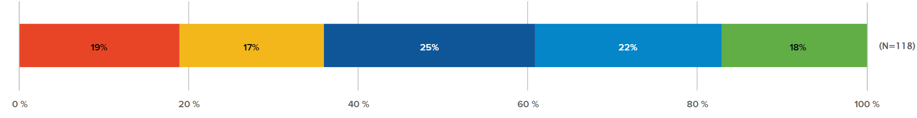
In reality, though, the answer options do not have equal value — especially if you’re in charge of keeping people satisfied! If you want to know how participants feel overall, it can be difficult to get the big picture view from just this breakdown.
So instead, let’s choose a Rating Radio Button as the question type. Sogolytics permits you to type in a weight value for each answer.
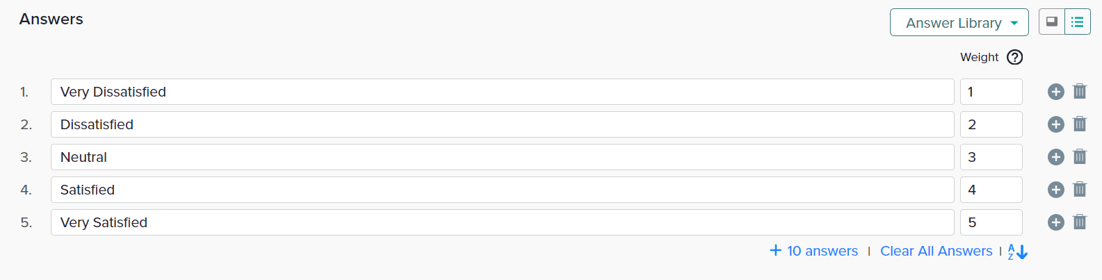
To the survey respondent, the weighted scale is invisible. They see only the question and answer options.
How is weighting calculated in rating questions?
When you, the survey administrator, review results, you will see the difference. Weighted scores and averages are provided in several reports:
- Omni report
- Bar graph (deprecated feature)
- Frequency report (deprecated feature)
- Advanced frequency report
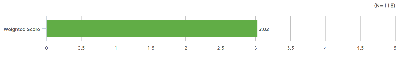
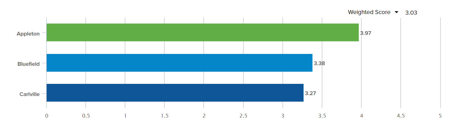
The bar graph report shows the weight for each answer and the score overall for the question. Compare the results here, with the unweighted results at the top and the weighted results below. With the weighted results, you can see that the overall response is 3.03/5. This gives you the opportunity to see the overall satisfaction level of your participants — and to better understand if satisfaction has gone up or down.
Another way to see the difference in responses is in a data table in Omni or even within the simple frequency report. In the results from the regular Radio Button, you see a basic table of results. But with the weighted answers, you see the average as well as the weights that were applied to reach that number. Nice, right?
Also note, in passing, that people who don’t respond to the question are counted as NULL; their answers are not incorporated in the statistics.
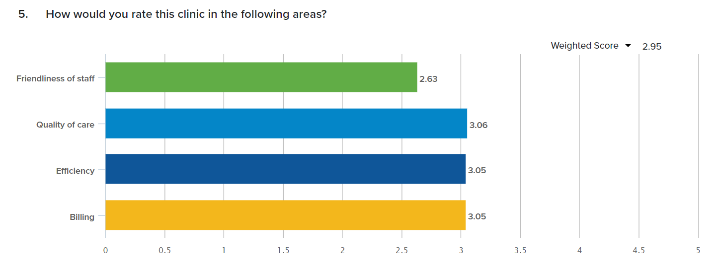
Something else cool? Rating is great if you want to compare satisfaction in different areas, as within a Rating Radio Grid question. This makes it easy to see the highest and lowest areas, as well as the overall average weighted score.
Something even cooler? Let’s say you want to compare satisfaction across different locations. Use a rating question with weights and then apply segmentation!
Suffice it to say, it’s great to rate. 😉
Ready to get started? Learn more about Sogolytics today!