
We get it: You’re busy! From questions to answers, it’s our goal to keep you getting the insights you need as quickly and easily as possible. That’s why our latest product update is designed to move you forward – not slow you down!
Dashboards that do more of the work
Download all your segmented dashboards at once.
Love Custom Dashboards? Who doesn’t! The only thing better is… Dashboard-Level Segmentation! If DLS is new to you, it’s like this: Make the master Dashboard in the perfect format of your choice, then slice it up into a different report for each group. Now, rather than downloading one slice at a time, you can export all the slices at once! Whether you’re providing site-specific reports for 100 schools or 35 branches, the time you’ve saved will add up in no time!
Show only the segments that matter.
For many, making sense of results is one of the biggest challenges in reporting. What to do? Clear out the clutter and get straight to the most important insights with conditional segment display! For example, highlight your three top-performing locations rather than listing all of them at once. Or vice versa – keep a closer eye on locations that are dipping below your target score so you can drill down into what’s up. Next level? Use a custom formula to showcase key variables (like change over time) or custom data sets to compare multiple sub-groups (like locations in the west region versus those in the east). One view, sharper analysis, no extra exports.
Deepen understanding beyond the metrics.
Love open-ended feedback? There’s nothing like hearing directly from your most important audiences, but reading everyone’s thoughts word-for-word can quickly take up more time than you have. Now, we’re adding more NLP insights to Custom Dashboards, allowing you easy access to fresh text gold alongside your critical metrics.
More context for experience programs
See your CX feedback on a map.
We all want to know how satisfied our customers are – but what if you could find out where your most satisfied customers are? Visualize the experience you’re providing your customers with a new interactive map widget on your CX dashboard. Explore by country, region or city, drawing on IP addresses, Tags, Directory fields, or Activities. Click to explore more, or get the whole data set to go in a convenient table.
Experience Navigator sets itself up.
When your focus is on improving experiences (we see you!), you know that a faster set-up can be a game-changer. That’s why we’ve upgraded Experience Navigator to streamline your roll-out. Just add your company’s URL and we’ll do the rest! Experience Navigator reads your site, pulls in your business model and value proposition, and takes you straight to objective selection with relevant suggestions already loaded. For CX and EX programs alike, go from URL to strategy in minutes.
Bring Directory and Activity context into CX comparisons.
Feedback tells you what customers think, which is great. But when you want to know more, you need to double down: Directories tell you who those customers are and Activities tell you what they’ve been up to. Now, include Directory fields (like role or location) and Activity attributes (like date or location) directly in CX Dashboard comparisons and custom datasets. So if satisfaction scores are dropping in one region, you can layer in Activity data to see what happened to trigger those reactions. Context that used to live in a separate report is now part of the same analysis.
Outreach that works harder
Send SMS invites that connect.
No surprises here: Customized messages get more responses, and SMS invitations are no exception! We’ve added Mail Merge to SMS invitations to help build recognition right away – the participant’s first name, the date of their most recent visit, or the name of the school their child attends – all to help boost engagement and response rates. .
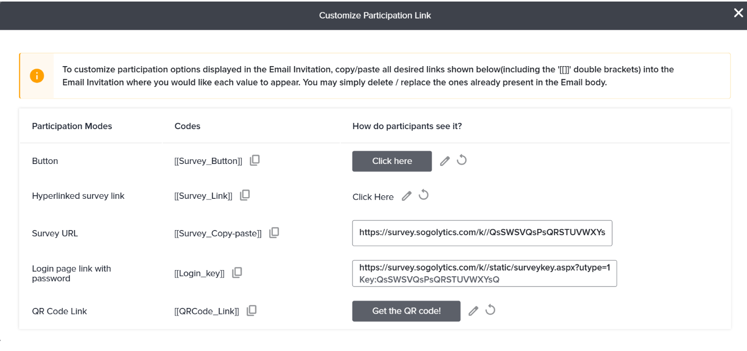
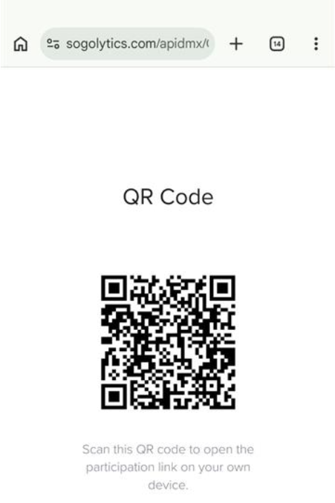
Link to a QR code to your email invites.
QR codes are quickly becoming one of the most popular ways to share and access surveys. Now, combine the power of QR codes with our robust email templates! You’ve already been able to customize participation links (buttons, hyperlinks, and more), and now you can add a link that leads to a QR code for easy use or download. More responses, please!
Know exactly why an invite wasn’t delivered.
Invitation not delivered? Find out why – faster! Explanations for bounced and “Not Sent” email and SMS messages are now easily accessible, and the status flow diagram has been redesigned to make those reasons even more clear. No more digging – just actionable next steps.
Verify Reply-To addresses before you hit send.
From a best practices perspective, customizing email templates is simply the smart thing to do, and this includes adding your preferred sender and reply-to email addresses. From a technical perspective, verifying that the reply-to email is a real address (that participants can actually reply to!) is the next logical move. We’ve also tucked away Reply-To and BCC fields under Advanced Options , keeping the main sending interface cleaner.
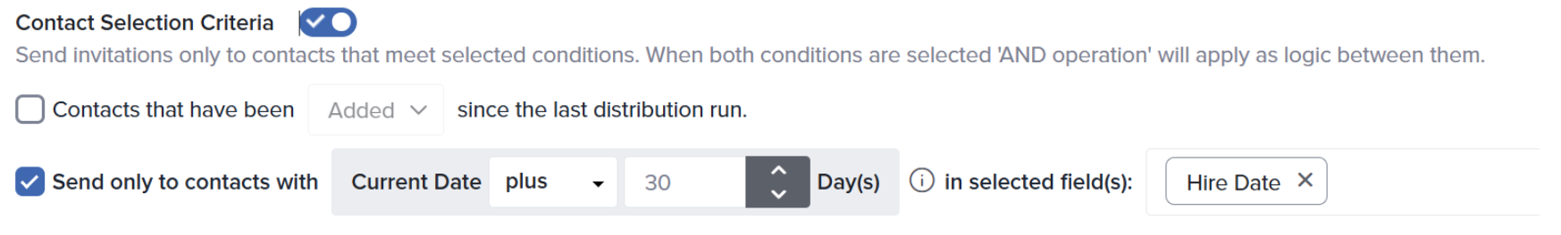
Time your outreach around dates that matter.
Tired of manually calculating “hire date plus 30 days” or other critical feedback touchpoints? When defining contact selection criteria in Automated Distribution, you can now set conditions using both forward and backward offsets from a contact’s date field, not just today’s date. So if you want to reach employees 30 days after their hire date, or follow up a week before a contract renewal, you can now build that logic directly into your criteria. The right questions at the right time – and less work on your end. Smart!